7 favourite upcycles from The Great Interior Design Challenge
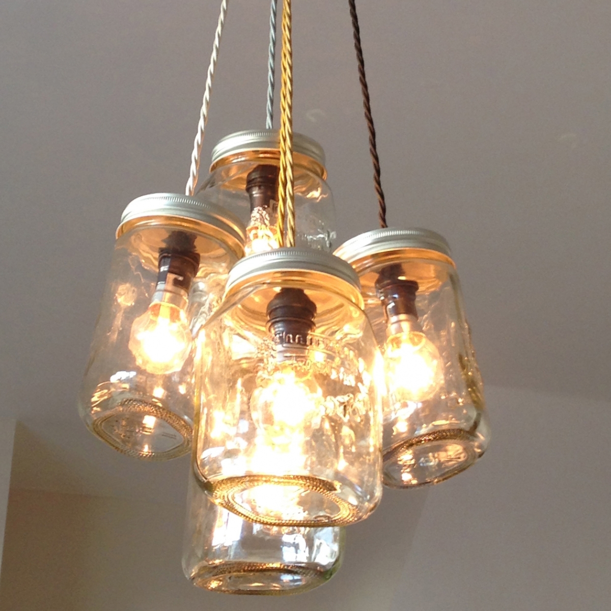
One thing that I love about being a part of The Great Interior Design Challenge is the sheer innovation and ingenuity that the amateur designers posses. The budget is purposefully tight so it really stretches their resourcefulness. Making something out of nothing is par for the course, but it’s also helps addresses a problem which most of us face. Oh to have the luxury to be able to go out and ‘shop for the look’. But as anyone who’s renovated a home will know, you’re soon in danger of running up a the debt of a small country. Instead the reality for most is when we update our homes we need do make do with many items of furniture that we already own, and often re-purposing that which we’ve fallen out of love with. Rather than feeling hard done by, I rather like it. It’s about being a creative rather than a consumer.
Setting the Upcycle Challenge also shows Daniel Hopwood and I that a designer can think outside the box. Not be limited by the tried and tested parameters of good design. Sometimes the results are disappointing but sometimes they make the hairs on the back of my neck stand up. Here’s a round up of some of my favourite product designs from Series 2 that particularly impressed us both. Can’t wait for you all to find out what’s in store for Series 3, which starts on the 1st February, three times a week, BBC2, 7pm.
Martins paintbrush wall hooks where a thoughtful and aesthetic product design for his Artist home owner.
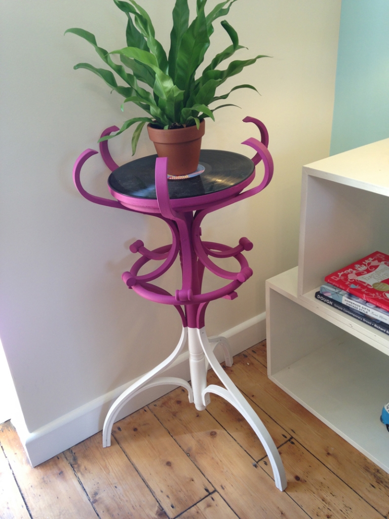 Luke amazed us by rising to the upcycle challenge. A coat rack became a side table in this music lovers living room. I especially love the additional attention to detail by painting the base in two colours.
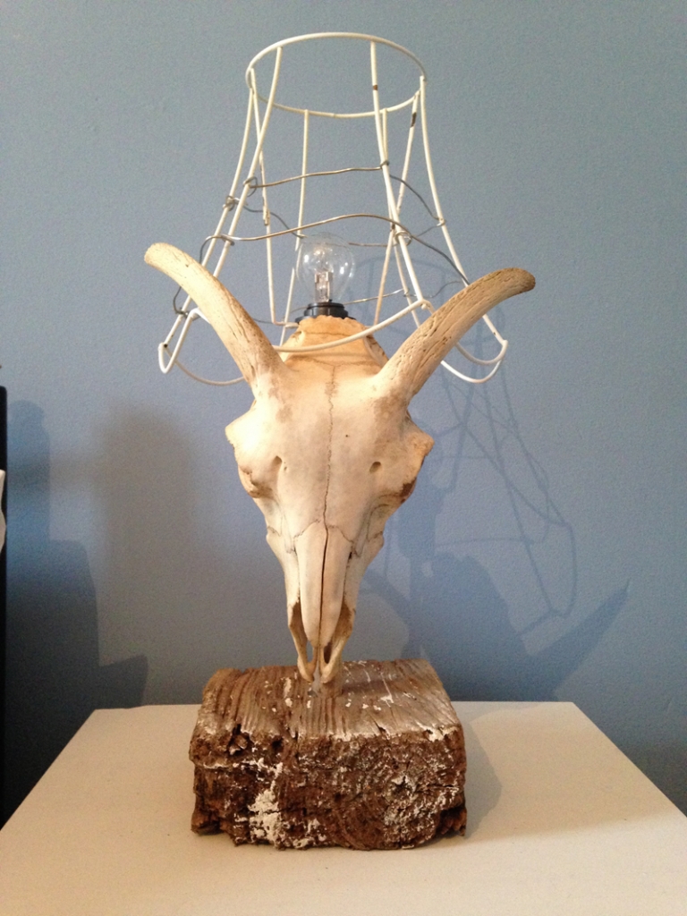 Louise fashioned a skull with antlers into a bedside lamp, ccomplete with drift wood base. It that totally bowled Dan over, he wanted to take it home.
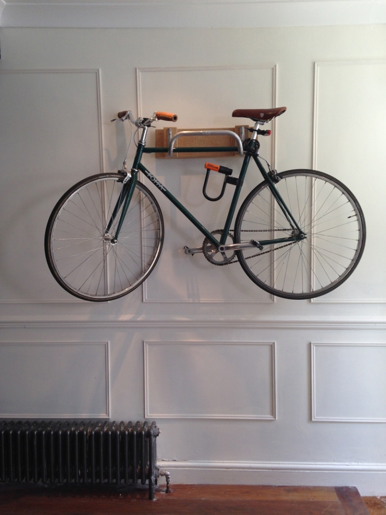

For more up-cycling inspiration check out this fab website I stumbled across called ReMadeInBritain. It’s a great source for ideas and materials. Also check out my own Pinterest board where I save my crafty inspirations. But better still have a rummage round your local carboot sale, flea market stall, charity shop and think about seeing things in a new light.




 What a joy was filming t


