Top ten interior trends, Podcast show notes S12 Ep6

I can’t quite believe that we have reached the last episode of the Great Indoors podcast series 12! We’ve had a blast as always recording it and a huge thank you to Gebrit for their support and sponsorship for this series. We are taking a little break, but fear not we will be back with series 13 before you know it.
We have lots to share on today’s episode, Kate chats with Sharon O’Connor, founder of Vintique upholstery about pre-loved furniture and we discuss the top ten trends for the coming season and beyond. It feels like a lifetime ago that we were able to go out and about and experience the latest interiors has to offer and finally, the trade shows are re-opening. The Milan fair, Salone del Mobile was held at the beginning of September and our very own London Design Festival is back at the end of the month and I can’t wait to see what it has to offer.
Dulux Colour of the Year 
It’s that time of year when colour forecasters eagerly await the announcement of Colour of the Year by Dulux. Last year I was a bit, shall we say, uninspired by the earthy tone of Brave Ground – it wasn’t the mood booster I was hoping for, but that’s in the past. Moving on to the colour for 2022, Blue Skies a far more light and airy tone which echoes a hint of optimism.
Ok, so it’s not the most thrilling of colours but I think it’s liveable and I would treat it like a neutral, so would work as a background colour or on the ceiling. If I wanted a room to appear bigger I would wrap it around the walls as it’s a lovely cool recessive colour and its calming – we all know that staring at a blue sky makes us feel good.

Blue Skies is a very pale shade (not enough saturation for me) but it is more than just about a colour, it’s about the mood.
Marianne Shillingford, Creative Director of Dulux UK, says: “Right now, people want to feel revitalised and enjoy the freedoms that are returning to them, to look out and bring in new ideas. What better inspiration can we take than the endless skies around us?”
Top ten trends
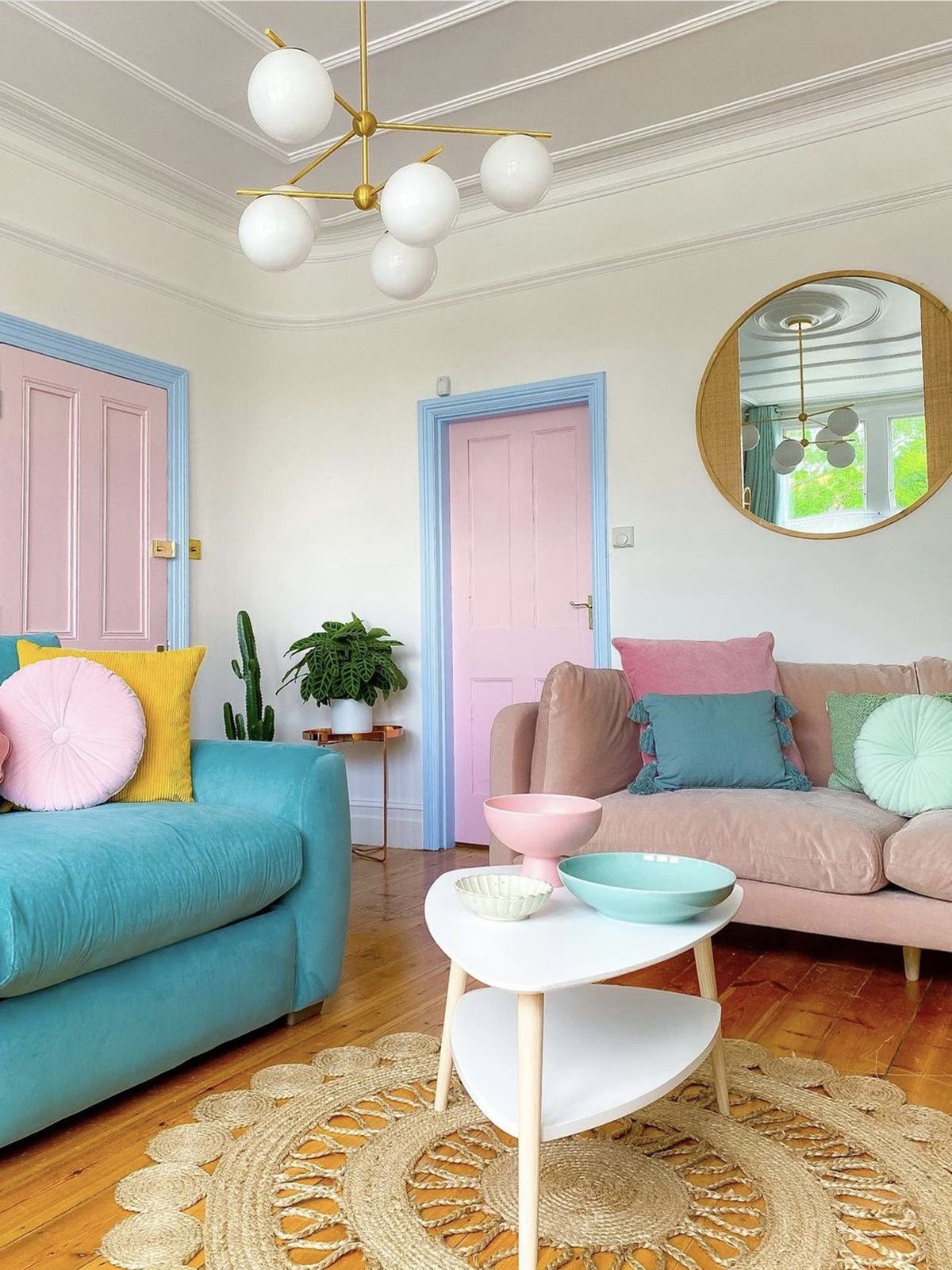
Would you go full-on pastels like @53houseplantsandme ?
Pastels
Staying with colour, I have seen quite a lot of pastels out there and particularly on Insta where people are using them altogether. For the last few years, we have seen a trend for bold colours like coral and emerald green but these are fading away, making way for softer tones where the temperature has been turned down. Pastels do tend to feel young, fresh and youthful but as we always say – rather than sticking to trend, go with what feels right for you.
House Plants
We have covered the topic of introducing plants to the home before and we spoke to Oliver Heath about biophilic design and wellbeing (see my show notes here) It was so interesting to see the subject covered in the weekend papers – not just the home section. It said how following the pandemic sales for plants have gone through the roof and #bathroomplants has been used over 25,000 times. According to The Times, the best place for plants to thrive is in the bathroom due to the warmth and humidity – so look out for the bathroom jungle vibe!
Maximalism
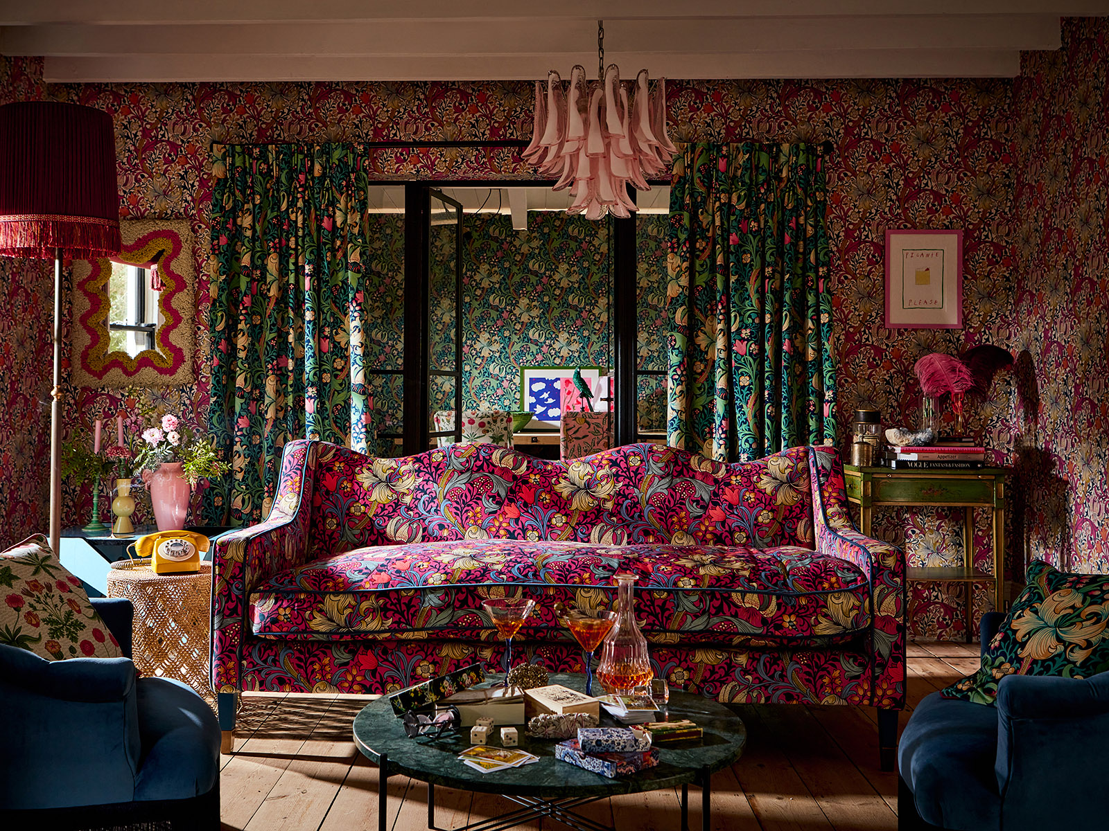
This isn’t a particularly new trend although I think it will continue with great strength into 2022. I was so delighted to see a recent launch by Sanderson the group that has 160 years worth of archive prints, including William Morris. They have reworked some of these prints but in the most amazing bright colours and the photography is a riot of pattern on pattern.
Liberty has reintroduced a wallpaper collection called the Modern Collector which is also a revival of archive designs with an abundance of colour and pattern.
It doesn’t have to be full-on colour and pattern it’s all about adding more layers to a scheme to create a rich and opulent feel.
Soft Industrial
Yes, the Industrial look has been around for a while but this take on it emerged from Pinterest. People are still enjoying the rough and rustic textures, although I’m seeing a much softer approach. We’re still seeing lots of black including furniture, but also softer elements like Berber rugs, velvet sofas and deep pile cushions. There’s no pattern here it’s all about the jostle of gorgeous textures.
Yellow accents

A yellow reading nook in the home of designer Orla Kiely
Yellow isn’t a wall colour for me but boy do I love pops of it all over the house and that be an armchair, cushions or simply accessories. It’s about adding a cheeky slip of yellow in a tone that you love and using it in unexpected ways.
Lighting
This is the perfect time of year to take on board some of the lighting trends out there. There’s a definite nod towards the natural – colour and materials – whether that’s raffia, rattan, wicker or wood, there are some beautiful decorative designs coming through. This ties in with the soft industrial trend – if you don’t want lots of colour bring in lots of textures.

French Connection is on board with the raffia trend, Thatched Globe light.
Warm neutrals
On our very first episode of the Great Indoors back in 2018, we discussed the notion that grey was dead. Well, actually I did and if I recall Kate said it was having a lie down! Now, I definitely think it’s six feet under and has made way for a much warmer neutral palette. Instead of a soft grey background, we’re heading towards, stone, pebble and taupe shades…..
Modern Farmhouse
……which ties in nicely with our next trend – this look is stripped back and perfect for the minimalist. Think wall panelling, tongue & groove and lots of vintage wooden furniture. It has a similar colour palette to the soft industrial look but without the black accents but generally a much softer look and touch. I feel like this has replaced the Scandi trend which featured an array of grey hues.
The pantry or larder

Get the pretty labels ready! A pantry cupboard of dreams, The Suffolk by Neptune.
We all know that we have strived to make our spaces work harder and there’s a definite want and desire for an organised pantry or cupboard. If you’re not lucky enough to have the space for a pantry then a larder cupboard has become increasingly popular. If you can’t quite stretch to a cupboard then some open shelving with an array of labelled ‘organised’ jars will do the job. This trend is very homely, organised and I have to say quite satisfying.
Cool Crafts
This trend came about after the last extraordinary 18 months with many people trying their hand at crafts and whether that’s block printed fabric or hand-painted murals it’s a hands-on approach to design. We can no longer just simply paint a piece of furniture – it needs to be handpainted – Bloomsbury style.
I’m all for it (of course) and I have seen so many inspiring ideas and designs on Instagram, Tess Newall is an incredible decorative artist, I’m a huge fan of Lucy Tiffney and I have recently spotted Dingley Dell Creative who hand-paints furniture with a folksy Swedish vibe and I just love the heartfelt sentiment and it feeds into my maximalist tendencies to have pattern on everything.
That’s our round-up of what we think will be big going into 2022 but do let us know if you’ve spotted anything on social media or what you are loving in interiors at the moment over on our Facebook group.

Kate knows the quality of the work done by our guest on the show! Kate’s chaise was reupholstered by Sharon O’Connor of Vintique.
Kate has inherited pieces of furniture that she has had reupholstered by our guest on today’s episode. For the rest of the show, Kate chatted with Sharon O’Connor, founder and Director of Vintique Upholstery who shares her tips on what to look out for when buying furniture on eBay and reveals some go-to places for affordable fabric. If you fancy trying your hand at a new skill Sharon also runs a course, Virtual Vintique: Upholstery Uncovered.
You can listen to the full episode here
A huge thanks to Geberit for sponsoring the series, the team at Feast Collective and of course our lovely listeners.
Image at top: Forbidden Fruits from the Archive collection at Sanderson.
comments
Ah this years colour Blue Skies is thankfully way more inspiring than last years colour! I can see working this colour in with our flower arrangements as well! Thank you for this lovely post!





 Welcome to my drea

 I’ve spent my whole car

 Are you ready to ban the b
 A love letter to my younger self...
Follow