The new workspace & Podcast show notes S3 Ep 5

From the glamour of Pearl Lowe’s gorgeous country pile last episode to today’s tour of Kate’s new downstairs loo, don’t tell us that we don’t cover all aspects of design on The Great Indoors. But that’s not all, we pour over droolworthy new interiors book that should adorn every style savvy coffee table, and of course, the usual design crimes. But first up, hottest design news brought to you post Clerkenwell Design Week by your favourite roving reporters.
This is a key design date in the design diary as the trendy Clerkenwell district of London is bursting with new design ideas, latest trends and product launches. Kate and I were invited to the press breakfast where we bumped into many a journo friend and interiors designers. We also went roaming with the podcast microphone to conduct some interviews!
Workspace redefined
The key theme from the festival was a focus on the workspace and how it has had to change and adapt due to the digital age. Traditionally the office desk was just that – a chair, a desk and a bit of storage, simply all we needed for a typewriter. Now with portable laptops, tablets and smartphones, the ergonomics of the furniture has come to the forefront and not only that the way we need to move throughout our day to stay healthy. Established & Sons’ At Work collection features this Lucio lounge seat (as modelled by me below) designed by Sebastian Wrong, which was developed around the notion that people are looking for the same comfort and style they expect at home, reflected in their workspace.

A new take on the office chair, the Lucio lounge seat designed by Sebastian Wrong for Established and Sons. Can’t see me getting up to much work though!
With more of us working from home these days, it seems less of us are using a designated office, and with some rather interesting research saying that it is key that we move around throughout the working day to increase productivity, this shift can only be a positive thing.
Coincidently, National Work from Home Day on 17th May aimed to promote flexibility and home working and our very own podcast stat queen, Kate said that the TUC recently conducted research which found that 1.5 million of us are working from home and it is increasing, and the majority being women in their 40s and 50s – Mums doing the work and family juggle. I can vouch for that and I find throughout my working day I don’t want to be restrained to an upright sitting position, so I can often be found on the sofa with my laptop.

If you want the comfort of your sofa as your office space consider one with substantial arms and scatter cushions for back support. Windsor sofa by DFS
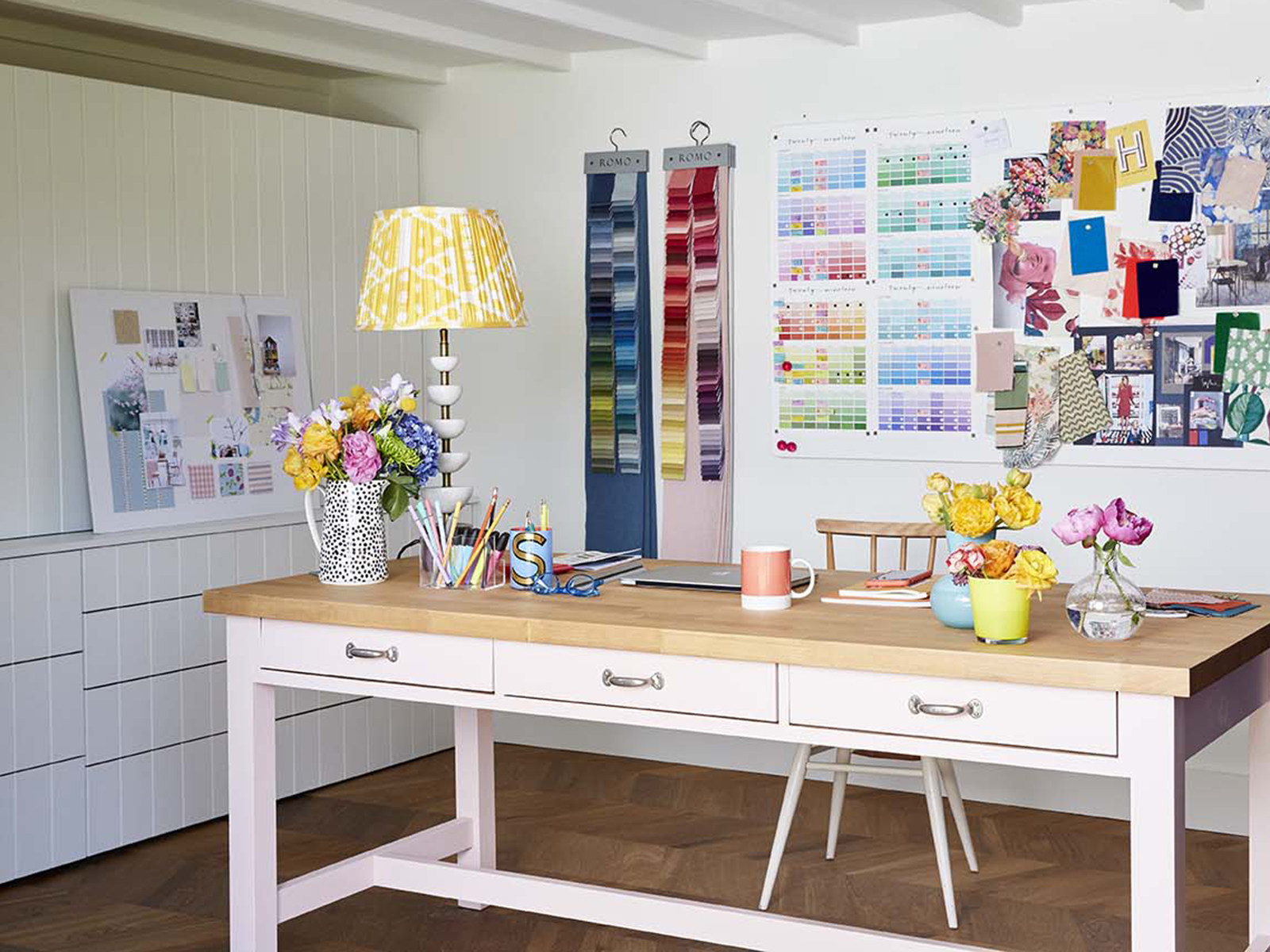
In my home, I didn’t want to dedicate a room solely as an office so I have a dual purpose office which doubles as my formal dining room (we mostly use the kitchen table but need the dining room for when we have visitors). I designed the space with a huge fitted storage unit for all my work supplies which are always hidden, this way it doesn’t impose when the space is being used for dining. Then, voila my desk becomes the large dining table.

My notice board and fabric hangings can easily be removed if I need to transform the space into a dining room. Photograph by Alun Callender
Colour trend updates from Clerkenwell saw lilac and mint being the new hues on the horizon. Would love to know your thoughts on that, as I’d say they are quite marmite colours but then everyone said that about pale pink and now that is so well established we are almost calling it a classic! Our sponsors Dfs confirmed that recent sales of pink sofas were up 146%, and yellow sofas up 87%. All music to my ears as we continue to champion banning the beige!
Book launch
We both get very excited by new book launches and have shelves groaning under the weight of interior design tomes. But do we have room for one more? The latest contender is huge (literally) and published by publishing heavyweight Phaidon. Interiors: The Greatest Rooms of the Century – is proof that interiors has been recognised and celebrated by the style mafia. Not only does it look fabulous with its sumptuous velvet cover, available in four colours – platinum, merlot, midnight and saffron so you can tie it in with your room scheme, but it’s bursting with rooms, all 400 of them. A sweeping view of some of the most exclusive homes designed by top interior designers, celebrities, artists and tastemakers across 27 countries spanning over the last 100 years. Let’s just say it is very elitist rooms but well worth a drool.
Kate’s downstairs loo
The big reveal was worth the wait. This very compact under stairs cloakroom is now marvellously adorned on all three walls, plus the door, with a fabulous waterproof mural called Coralful in browns, terracotta’s and creams – all Kate’s colours. Isn’t it a triumph, and the picture just can’t do it justice, it really is a rather magical space.

The Coralful wallpaper is available at West One Bathrooms
Much to my surprise, I actually like the black wall hung loo (slightly irritated when I get these things wrong!) and it has a matt finish which Kate tells me is all the rage in sanitary ware. So no more glossy loos, I have to admit it’s looking very sleek.
Design Crimes
This week it was my turn to add to the list of crimes and it’s fluorescent strip lighting. It stems from my early years in a magazine office which, while I loved the job, I’m traumatised by doing late night deadlines under rows of harsh strip lighting. No matter what time of day, the lighting stayed the same and it was hugely unflattering, and depressing! However, just before I threw it into Design crime room 101 Kate declared that those clever boys at 2LG Studio have re-invented the strip light with Cameron Design House and completely turned it on its head. Here I am eating my words again. Looks cool doesn’t it!

The Capsule Saldo light is available in different finishes and bespoke options
As ever, a huge thank you to DFS for their continued support and sponsorship and to our fab producer Kate Taylor. If you haven’t already, you can listen to the full episode here.


 Watch as I layer some of my
