The Great Indoors Podcast S2 Episode 3 Show Notes
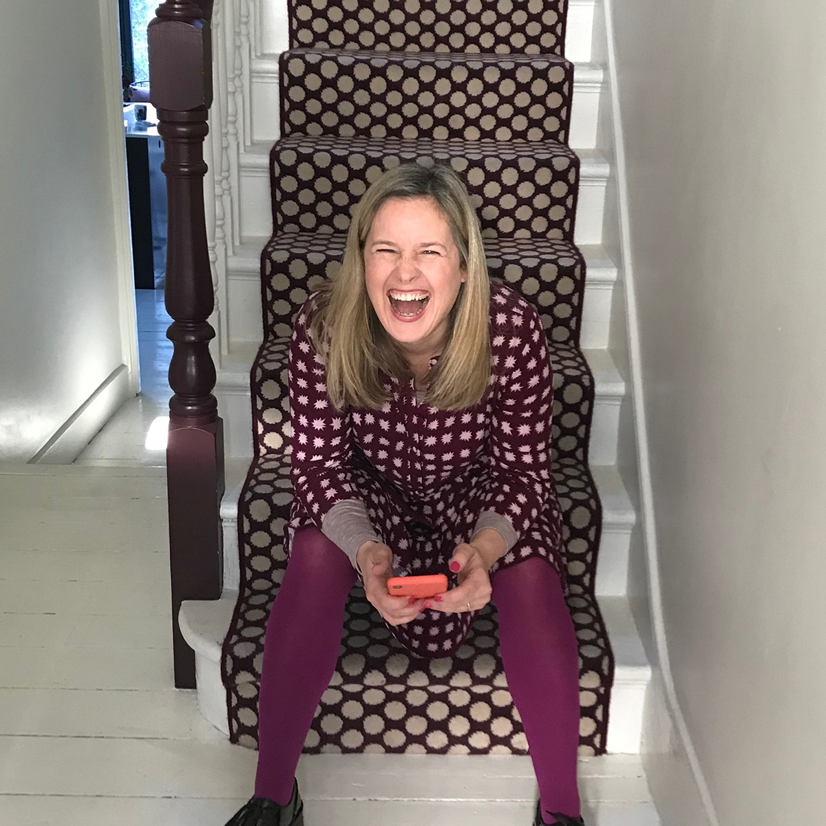
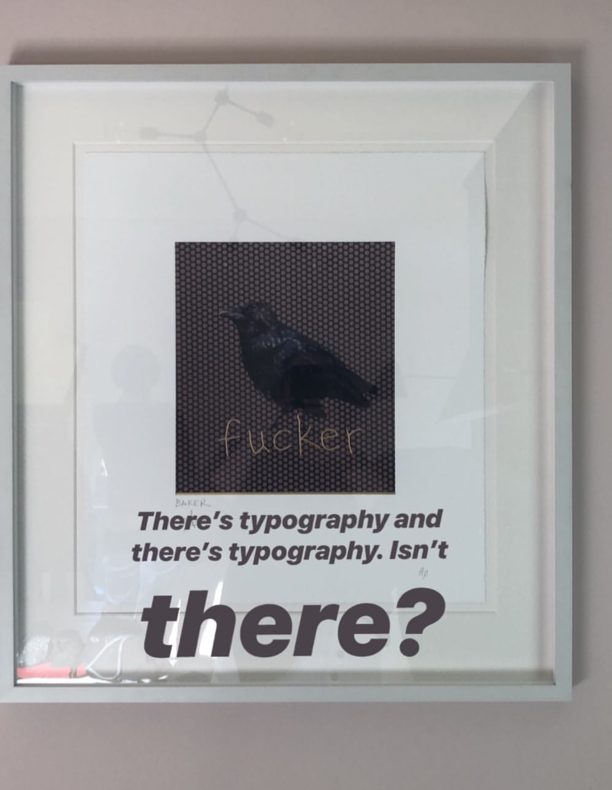
For this latest episode of The Great Indoors Podcast, we recorded at Kate’s house in North London, where I discovered some Typography artwork, can you believe it! She was so busted! When I’d got over ribbing her for that we got down to some juicy debate over the trends we saw at Maison & Objet, how to plan a dressing room and how to make the most of your small spaces. If you haven’t caught up yet, you can do so here.
Maison & Objet trend report
Here are a few of the key trends that we discussed having seen them at our recent visit to Maison & Objet trade show in Paris in January.
- Luxe styling with plenty of polished gold finishes on furniture and accessories
- The greenery trend continues with plenty of palm and jungle motifs
- Lots of cane and rattan furniture and accessories
- Curves and lozenge shapes
- Cream is the new neutral. There was no grey anywhere
- Texture is big news in textiles and wall coverings. Boucle, knits and quilted designs in textiles were the news
- 80’s Memphis styling
- Warm tones of turmeric yellow, maroon and putty pink was a strong colour story.
How to design Small spaces
This is a problem area for a lot of people, wanting to create a feeling of more space in their small apartments or small rooms within their home.
- First up listen to episode 1 of series 2 and get rid of your having too much stuff. If you have a tendency to hoard then you need to learn to let go!
- Next, tackle the storage and make sure you have enough to be able to put everything away to avoid unsightly dumping grounds
- Create some negative space in a room, for example, pull an armchair away from the wall rather than having everything pushed up against the walls.
- Aim to see as much floor space as possible by choosing furniture like beds and sofas that are raised on legs.
- Buy furniture that is the right proportion to the room. Avoid oversized bulky sofas and armchairs in small living rooms.
- The DFS Capsule Collection is designed specifically for small living spaces. Furniture has slender arms, space-saving proportions and can come apart for easy access.
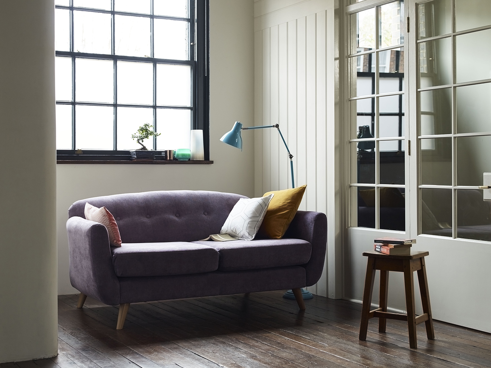
The Capsule furniture range at DFS is designed specifically for small spaces. Look for compact shaped furniture and raised on legs works helps you see more floor space
- In terms of styling, avoid a cluttered look and go for one statement piece instead, like a large piece of artwork in favour of lots of small pictures.
- Mirrors and glossy painted surfaces help to bounce the light around.
- Decorate in recessive colours to help make a room appear larger.

A small room looks larger if you paint out all the wood work and fitted storage in the same or similar colour.Walls painted French grey by Farrow & Ball.
- Homogenise the space with paint. Paint skirtings, doors and fitted joinery in the wall colour to eliminate cluttering up the space visually.
- In kitchens choose flat fronted doors, and no handles to keep the look feeling spacious
How to plan the dressing room
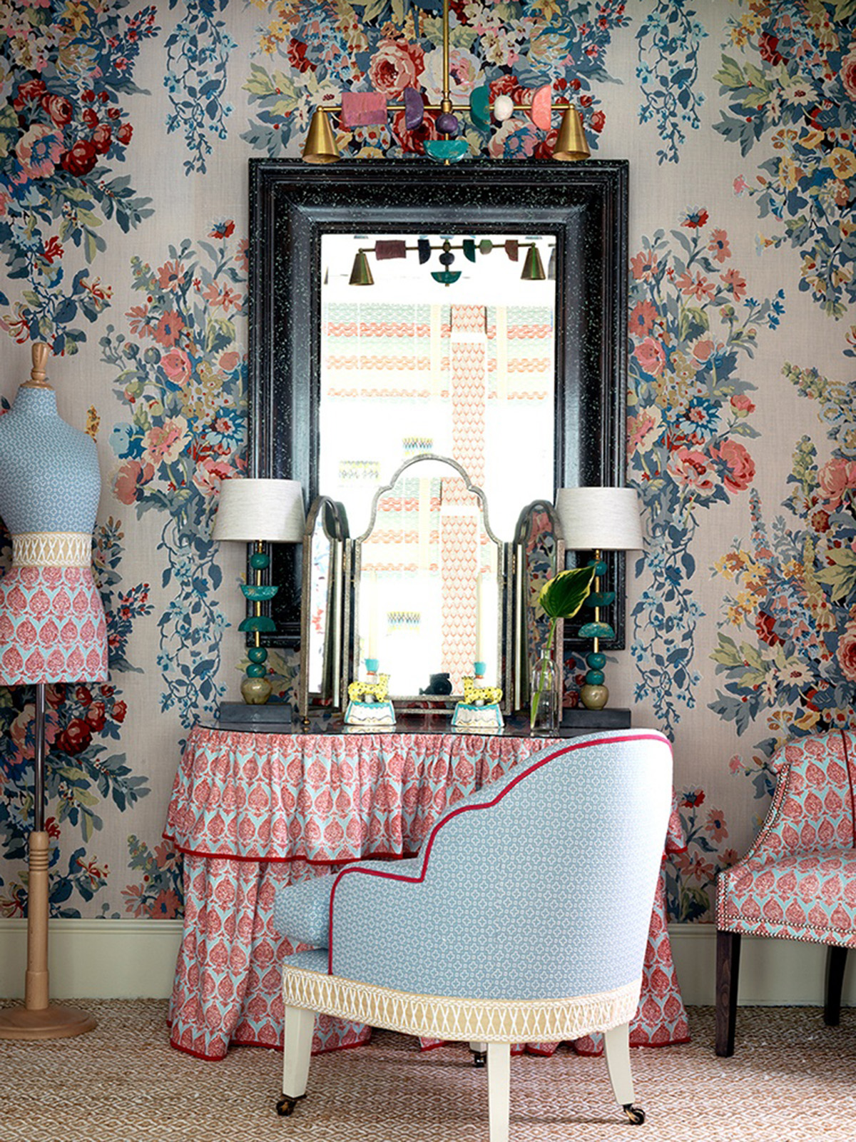
My dream dressing room would be some maximalist parlour like this one, designed by interior designer Kit Kemp showcasing this wonderful wallpaper by Turnell & Gigon in their Chelsea Harbour showroom
This was an opportunity for me to indulge in my fantasy to one day own a dressing room, a room just for me that feels glamorous and that the builder husband has no input in. I’m thinking guilt ceilings, chandeliers and Chinoiserie wallpapers! Here are some key tips and ideas we shared on the Podcast
- According to estate agents, a dressing room is now considered to add value to a property and make it easier to sell
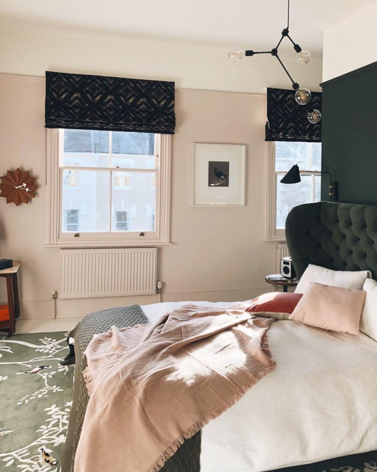
- Kate’s bedroom has a dividing wall at the head of the bed which has allowed her to have a walk in style wardrobe behind it.
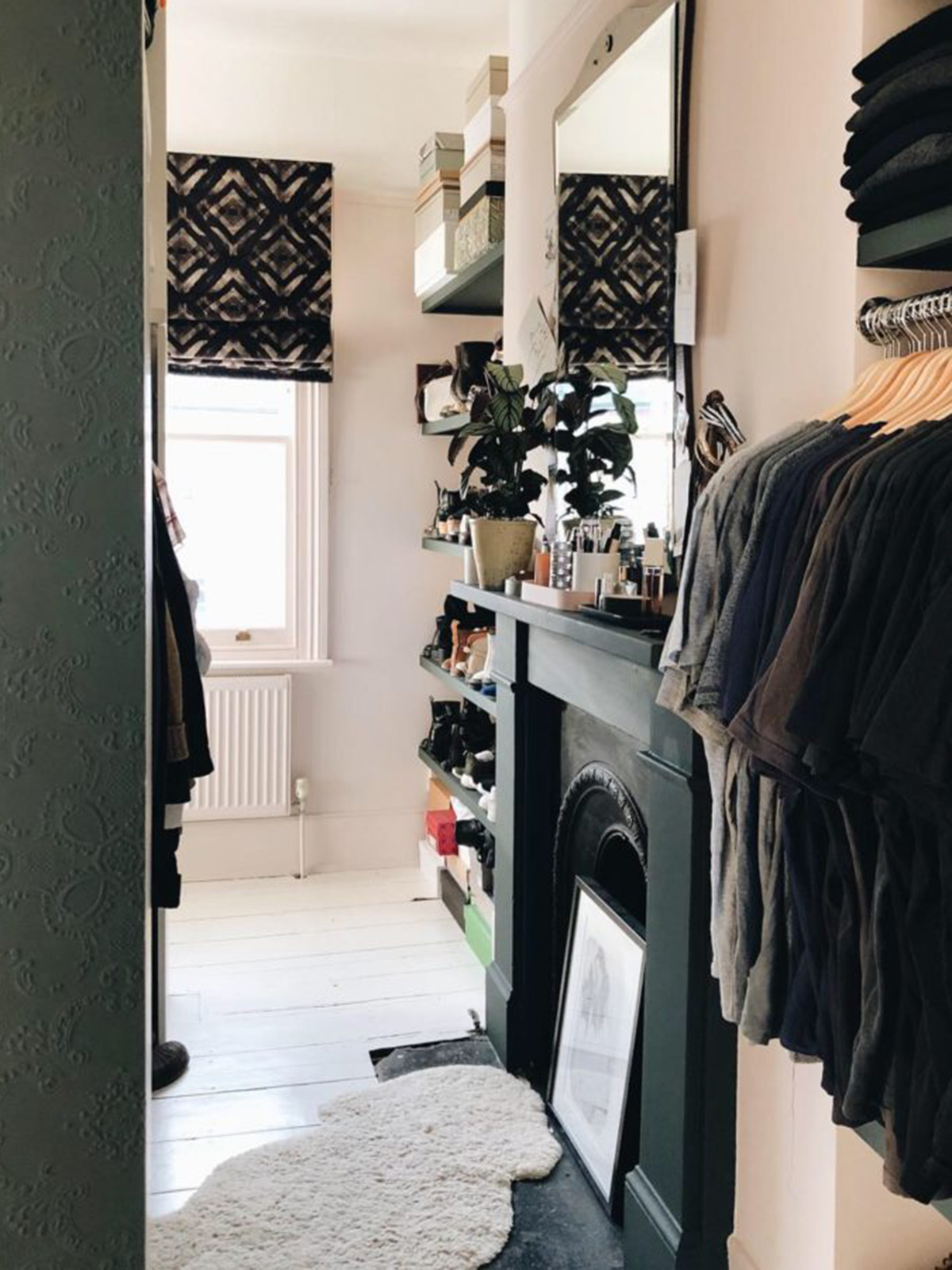
Kate’s large bedroom has been divided into a bed area and an area that conceals all the clothes storage
- Consider foregoing a bedroom in favour of a dressing room, complete with fitted storage, drawers, make-up area and a place to organise jewellery.
- The Ikea PAX range is an affordable way to get a fitted wardrobe system. Then customise or make your own door fronts. You can add wood veneer wallpaper by Arte for a luxury marquetry look.
Design Crime
The design crime this week was black bathroom suites and sinks. However, Kate is having a black toilet added to her downstairs WC so watch this space! I recommended two accounts to follow on Instagram for design crimes to have a chuckle at, @pleasehatethesethings and @hunsathome
As ever, thank you to DFS for sponsoring this podcast and to Kate Taylor our producer. And thank you to my blog editor Luisa Ferdenzi for helping me compile these podcast notes. You can listen to The Great Indoors on any podcast platform including appl podcasts. If you find yourself there, please do give us a rate and review, which helps us get a boost in the rating and reach more listeners.




 Around here, we


 After
From beige to boom! My bathroo


