Mum’s Granny annex reveal- the open plan kitchen living room
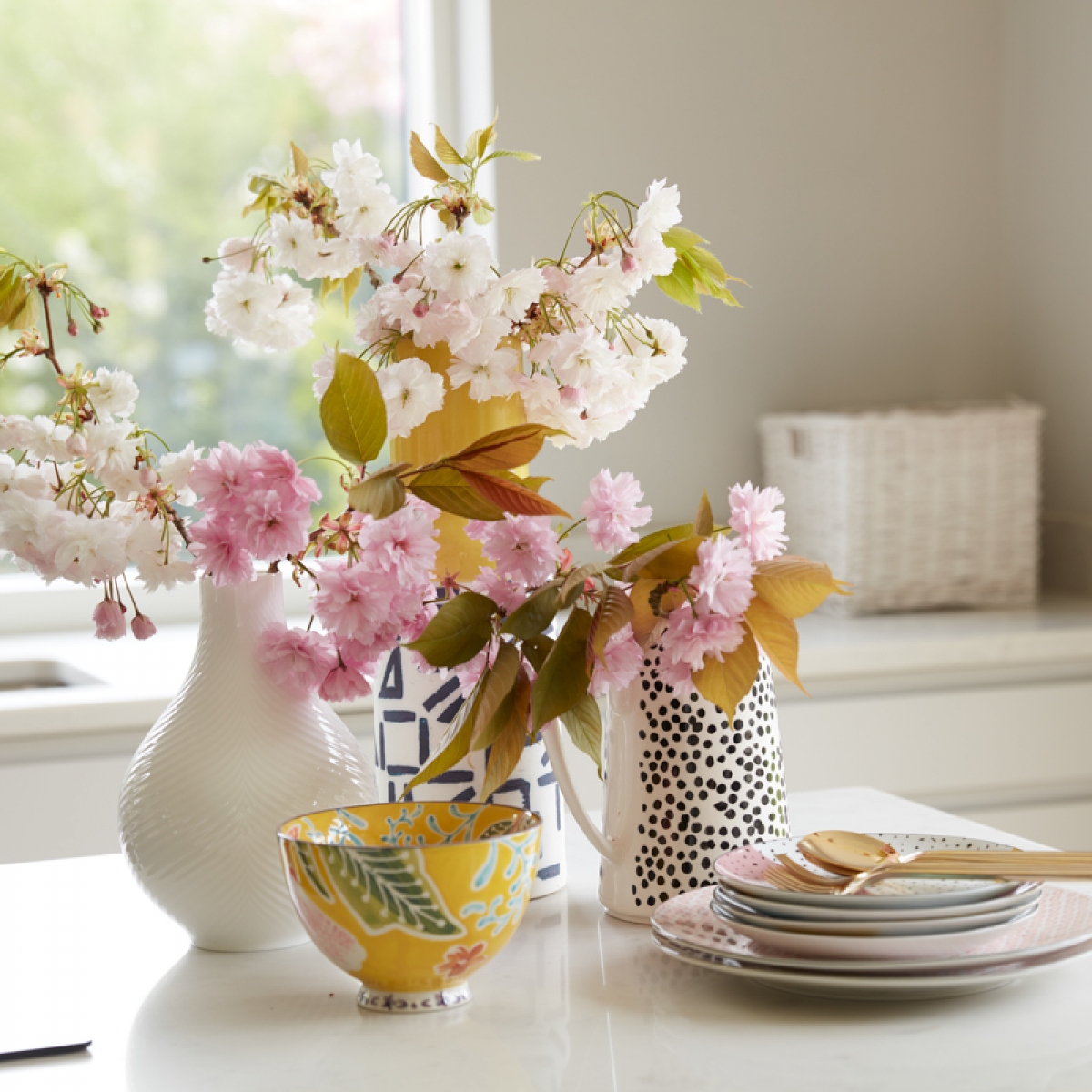
So a year after moving in I’m finally ready to show you the reveal of Mums ‘Granny’ annex. Having her living next door has been just a dream and we’ve really enjoyed designing her new home together. After the pain of selling up the family home and renting for six years its been a long time coming! But this is a fresh start for Mum and it’s been an absolute delight sharing this part of her journey. Over the next few weeks I’ll be sharing each room reveal, so make sure you subscribe to my newsletter so you don’t miss a thing.
To kick off I’m going to share the main open plan living area- which is the real heart of her new home. We’ve created a really lovely light and open space with the living, dining and kitchen all open to one another with the aim that her compact two bedroom build feels as light filled and spacious as possible. Harnessing the views was totally key to the design and we invested in these amazing huge picture windows from Velfac. They are aluminium on the outside but timber in the inside which makes them have a much softer feel and appearance, and you can have them painted to any colour you want. We went for a soft off white, as it helps keep the focus on the view outside rather than to the window frames. They were made to our architects spec and we went for their large siding doors at the back as a more practical and user friendly alternative to bi-fold doors. They are a dream to use.
Next up we created a soft and light backdrop using French Grey by Little Greene which is one of my all time favourite neutrals. I then paired it with French Grey Pale on the ceiling rather than brilliant white which would have been too harsh in this sunny open plan space. Going with the light and bright look we chose a oak engineered floor with a raw texture too it and soft light grey wash. It’s Imperio Rough grey oak oiled by Quickstep and a year on Mum is thrilled with how it’s keeping up. It has a lovely light appearance but the rough grain really adds some warmth and texture to the room. It’s also super easy to keep clean and withstands muddy boots and paws very well. We’re really thrilled with it and get masses of compliments.

Walls and painted units in French Grey by Little Greene. Kitchen by Ashfield Kitchens. Teltos Worktop, Landford stone. Pendant lights (discontinued) Heals. Originals bar stool, Ercol.
I decided to take the pale grey across and over the entire kitchen. The colour was also colour matched and sprayed onto the kitchen units from Ashfield Kitchens (who are part of Clive Christian at Forest Row). The local company supplied us with pre-primed units that I then sent to a furniture spray company who expertly spray painted them all up to match the wall colour. The idea being that the kitchen very much blended into the back ground so the sofa and dining areas could become a stronger focal point in the room. I don’t understand why in an open plan space you’d ever want to focal point to be the kitchen area.
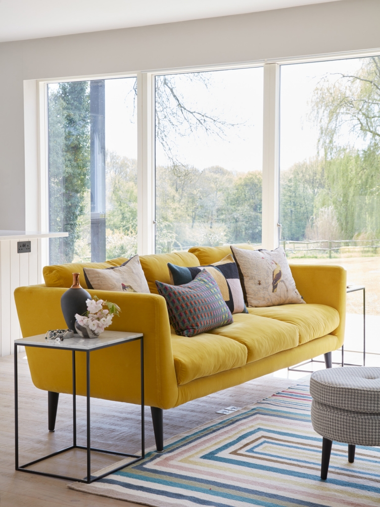
Holly sofa, Felix footstool, Sofa.com. nestor side table, Habitat. Abstract Malachite oplain rug, Designers Guild. Golden priole cushion, Timorous Beasties. Suki cushion, Margo Selby. Charleston cushion, Nikki Jones.
With the the basic scheme a neutral soft grey with accents of black, it allowed us to next work on popping the colour. Colour is a great way to draw the eye to areas you want to celebrate and away from places you want to hide. A bright canary yellow Holly sofa from Sofa.com takes pride of place in the center of the space and looks just incredible as the colour is just so feel good. We picked up the rug in the sale at Designers Guild which anchors all the other colours throughout the scheme. I love the way the different patterns in the cushions and the rug all link together, while nothing matches. It creates a very individual and eclectic look.
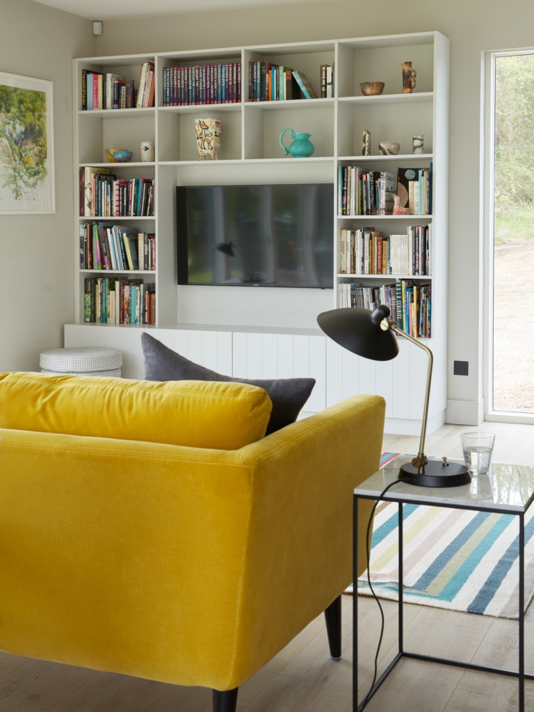
Fitted media unit designed and fitted by local joiner at Ark Builders. Nestor side table, habitat. Milton desk lamp, Heals.
With open plan spaces it is crucial to choose the right furniture. With the lack of walls you also have less wall space on which to position furniture. A made to measure bespoke media unit suits the space perfectly and again matched into the wall colour allows the books and collection of pottery to be the focal point. This unit was made by the joiner at Ark Builders who did all the build and fit out in the Annex. This piece cost around £1300 unpainted.
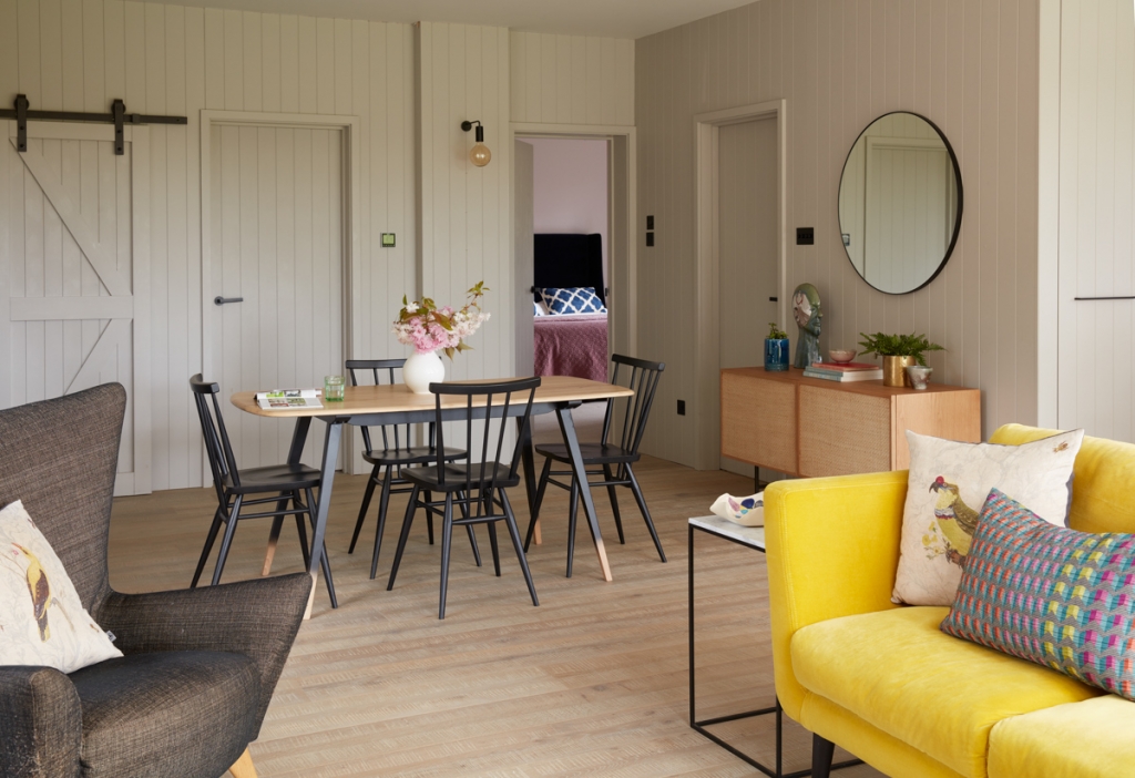
Originals plank table, All purpose chairs, ercol. matador armchair, Content by Conran. Imperio floor, quickstep. Ascaridiosis sideboard, La Redoute. Patsy mirror, Habitat. Junction wall light, Heals.
We decided to clad the internal wall in floor to ceiling tongue and groove. In a new build with crisp walls I felt this would add a little country modern and texture and interest to the space. I had the carpenters router the fire doors to match in with the lines of the tongue and groove which I think is a natty little detail.
The tongue and groove wall panelling is pre-routered mdf panels that we ordered from our local timber merchant Wenban Smith is Sussex. These were cut to size at attached on batoning to all the internal walls. I then used the tongue and groove reference throughout the house, on furniture and doors to give the whole space coherence.

All purpose chairs, Originals plank table, Ercol.
Next week I’ll be giving you a look at the master bedroom. Scroll to the bottom of this page and sign up to my news letter here to be the first to see it!
To catch up with the entire build of the Granny Annex project from start to finish, hop on over to my YouTube channel here. And i’m happy to answer any questions in the comments below.
Photography by Tim Young.





 Around here, we

