Interview with Stephen Westland, Professor of Colour Science, Podcast show notes S11 Ep6

The end of another series of the Great Indoors podcast is here and to celebrate we recorded this episode at Kate’s house, which I haven’t visited in over a year! I think the excitement got to us a little – lots of giddy laughter to be heard on this one. We are also, so delighted that the podcast has really peaked recently and can this be because more people are discovering the thrill of designing your own home.
Our fabulous sponsors Harlequin are also at the forefront of the interior design revolution and will soon be launching an online tool to help you crack your personal colour code. They are calling it ‘Own the Room’ which will involve a series of detailed questions to discover your interior personality which will lead you to four distinct looks. It launches on the 1st of July so do check it out at harlequin.sandersondesigngroup.com.
On with the show and today, we have a fascinating interview with Stephen Westland, Professor of Colour Science and Technology at Leeds University, in which he shares surprising insights into our relationship with colour. And for a bit of fun, we discuss a video I unearthed on YouTube about Stylish things every stylish person should have in their home. Tune in to find out how stylish you are!
OUR LATEST DESIGN CRUSH: HALSTON
But first, we just had to chat about Halston, the Netflix series starring Ewan McGregor as the fashion designer who started out as a milliner and rose to fame when he designed the pillbox hat Jacqueline Kennedy wore to John F. Kennedy’s inauguration in 1961. But of course, on the Great Indoors, it was the fabulous interiors that caught our attention.
We have seen somewhat of a revival of 70s style and this show is set within the decade through to the early 80s so it features all those design features we’ve been seeing and talking about. It really is a visual feast and I just love the attention to detail. I think part of the reason he was so pivotal at the time was the whole lifestyle and not just the fashion – it was who he was seen with, Studio54, fast living and high glamour.
One thing I got from watching the series was his appreciation for feminine sensuality, he wanted women to not only look fabulous but feel fabulous and the feel of the fabric was just as important as the cut and overall look. This was echoed in his interiors, which were sleek and pared-back and then you were hit with a multitude of oversized orchids. I just love the quote “Orchids are part of my process and you can’t put a price on inspiration” when questioned by his accountant on how much he spent a year on orchids.
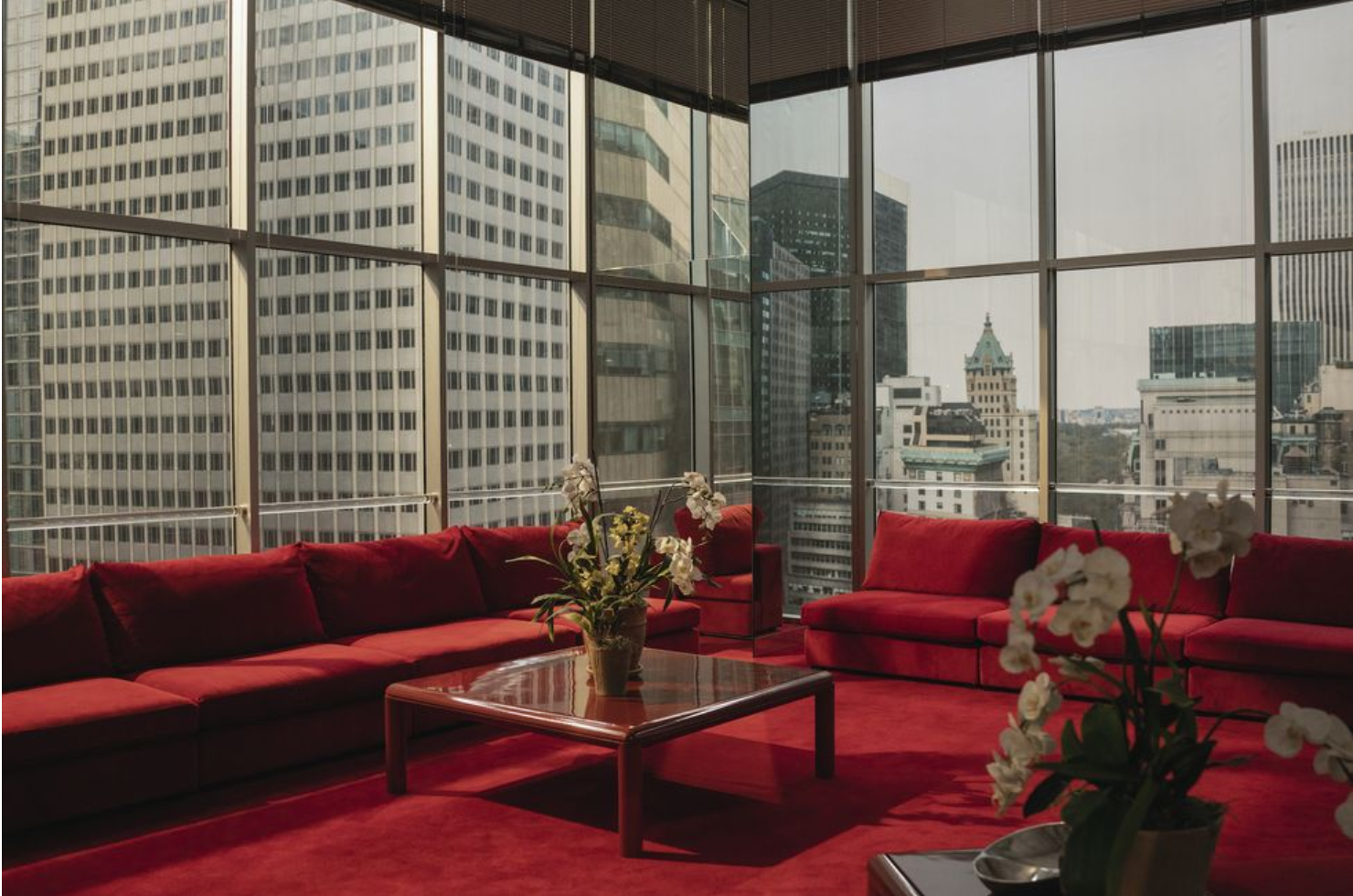
Halston’s living room was a masterclass in grey. Grey carpet, grey sofa and grey walls. The theory behind that was it made the people in the room stand out and they provided the decoration. However, with glamorous guests like Liza Minelli, Bianca Jagger and Andy Warhol, that would work! I’m fascinated to see if this sleek minimal luxe look takes off in interiors, and with it the connotations of a lavish and glamorous life style. While Halston didn’t design furniture during his career he did create a lifestyle brand that I think continues to inspire us, even today. I want a wall to wall blood red office overlooking the city. What do you think?
Interview with Professor Stephen Westland
I loved loved loved our interview with Professor Stephen Westland of Leeds University here. He has written a white paper on colour for interiors for our sponsor Harlequin which can be found in full on their website here. His particular areas of expertise is colour science, including machine learning, colour imaging, colour design, lighting, health and wellbeing. All in all, has Stephen has a deep fascination with colour – something I can certainly relate to.
My first question had to be: What does a professor of colour do in a typical day?
“People think it’s a real niche topic, but if you look around your room, everything is coloured, all those people who make those things are really concerned about making the right colour and what they mean. Most companies who make anything will employ some kind of colour scientist. One thing I like about my job is every day I could be approached by someone who wants to talk about the colour of Weetabix, teeth, skin or cosmetics – I literally don’t know what’s coming next.”
Colour plays such a big part of interior design and our homes, what was it like to work with a fabric and wallpaper brand and to dig a little deeper than the surface of colour?
“It was a great fit. One of the things I’m trying to do with my research is to find out what’s true and what isn’t – this colour makes the time go faster, this colour makes your heart beats faster! The effects of colour are so complicated, you can get slightly different results by changing the conditions slightly.”

Red is understood to be stimulating. Image by Dulux
“It’s generally accepted that if you a have red environment it’s stimulating and blue is calming. It’s true, although research says if we look at too much blue light at night it stops us from going to sleep and has an alerting property. So, therefore, you have a real conundrum – on one hand, blue is calming and on the other, it’s stimulating.
“ Your eyes respond to light and send signals to the back of the brain but the eye sensors also send signals to a different part of the brain which is in the middle and regulates our temperature, sleep patterns and controlling the secretion of hormones. All that process to do with your wellbeing is controlled to some extent by patterns of light. In the white paper, I refer to them as physiological effects. If you’re in a room with blue painted walls in the bedroom, almost certainly the dominant effect will be the emotional psychological one so is blue a good colour for bedrooms? Absolutely.”

If you did want a blue bedroom go for a light with a soft amber glow for the perfect harmony. Image of Room nine at the Rose Hotel by Nicola Harding.
In the paper, Stephen says that light has a more intense effect on us than an ambient paint colour in the background.
“Think about how we evolved, we worked outside so we had loads of light in the day and in the night we had very little light – candles of firelight which is very reddish. So it’s good for our bodies to have loads of light in the morning and as the day goes on less and less intense light.”
“I think colour isn’t just fun, it’s important for our health and wellbeing. We have a room at the university where we can change the colour of the lighting, not just red, green, blue but literally wavelength by wavelength – we measure heart rates, people’s emotional wellbeing, brain responses in order to come to these conclusions.”
“People at transitional or stressful times of their life may wish to temporarily want to create extreme environments.” Cue Kate and her desire for a yellow kitchen during lockdown – for those who may not know, Kate hates yellow!
It’s not easy to find your happy colour especially when there are so many variants out there, the point that Stephen made was that you can find your joy in colour in different and unexpected ways. He loves red and is a huge Manchester United fan.
“I hope that once lockdown is over people will continue to use colour and know it’s ok to paint your room in crazy colours.”
Are you stylish?
STYLISH THINGS STYLISH PEOPLE HAVE IN THEIR HOMES
I thought we’d end the series with a bit of fun and I couldnt wait to share this video I fell across on YouTube by House of Valentina, entitled ’10 Home items that all stylish people always own’. I was desperate to quiz Kate whilst in her home to see just how stylish she really is – you’ll have to listen to the full podcast to discover the results!
But in short here is a recap or you can watch the video in full here...
- Cute soap pumps – you need to decant shop bought soap into a ‘stylish’ pump.
- Beautiful baskets – everyday items become more chic when they’re in a basket.
- Blankets – blankets in baskets for a double score!
- Pretty doormats – all about first impressions. According to Jack and Valentina they have to be “super stylish and super cute.”
- Candles – not just a scented candle but a lit scented candle.
- Coffee table books – it shows them who they really are.
- Seasonal door wreaths – “It completes the welcome home package,” says, Valentina.
- Appropriate stemware
- Fruit bowls and cake stands
- Tea towels
Do get in touch with your stylish must have’s and any other TV related interiors, on our wonderful Facebook group The Great Indoors podcast.
Huge thanks to Harlequin and Proffessor Stephen for his fascinating insights and knowledge, thanks to our fab producer Kate Taylor of Feast Collective and of course our lovely listeners. The next series will be right along in a couple of weeks.
