How to interior design a She Shed- Part 2
Here’s a factoid for you, 51% of sheds are bought by women. The She-Shed is a ‘thing’. Its a space outside the home where the girls can get away from it all. Sound good? Enter here to WIN this one!
The She Shed offers up a perfect bit of me time and me-space. I’m really intrigued by this new phenomenon and rather than visualise ladies drinking gin and reading 50 shades of taupe I like to think us girls are using the extra space as a creative hareem. So when I was invited to design my very own She Shed for Hillary’s I did so with gusto. My space was going to be a reflection of the kind of space I like to dwell in, all dark, moody and cocooning but then positively popping with pattern and colour. It’s somewhere to get creative, dream up projects, get up-cycling and sticking poms poms on anything that doesn’t move. With every design project I urge you to tap into your own sense of style. Go for that colour that makes your heart beat a little bit faster and surround yourself in the things you love.
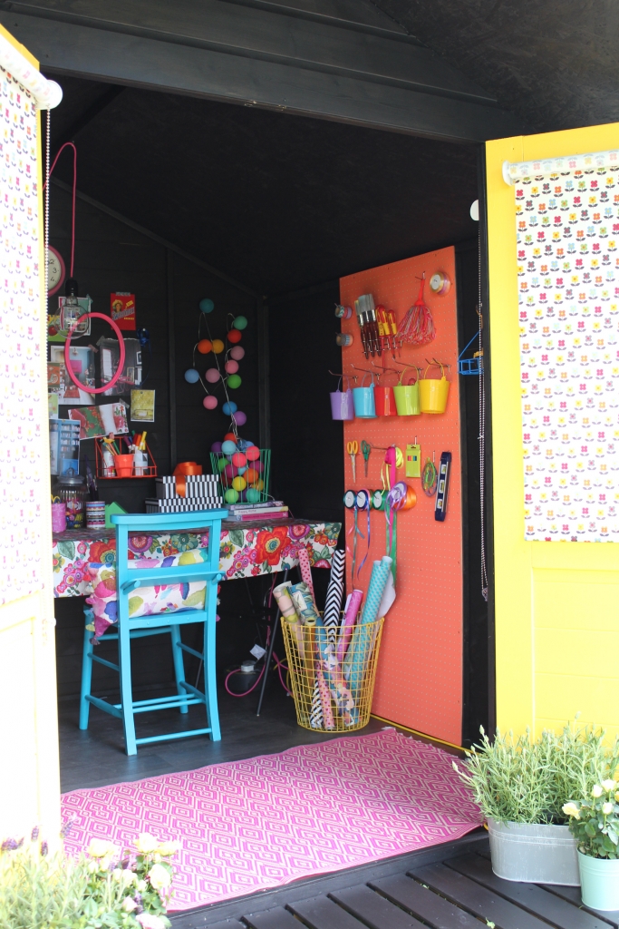
Black Ash exterior with a pair of ‘Hello Sailor’ lemon zest doors in Bonjour look delicious and give a cheery welcome. I then when the whole hog and painted the interior black too.
With the black backdrop you can now easily layer up the colour and pattern. To break up the dark I use blocks of strong colour. A pink rug on the floor, a panel in Bright green and coral orange, I chose Grenouille and Electric Clementine from Valspar. The pink rug, from Blackout, is plastic which makes it perfect for keeping outside. I also chose a black vinyl floor from Hillarys as it’s really practical for any work space.
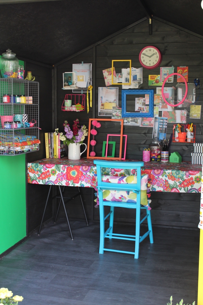
I then popped in my painted chair which is painted Blue Kale by Paint by Conran. Along with the yellow doors the four colours balance each other tonally. Next up its time to add the pattern. I chose a strong print for the worktable, a practical oil cloth in Amparo print from Norfolk textiles. The other key element was the cheery retro Nelda Fruity roller blind from Hillary’s. The ditsy sized print is the perfect scale for the small windows and the multi coloured motif helps pull the whole scheme together.
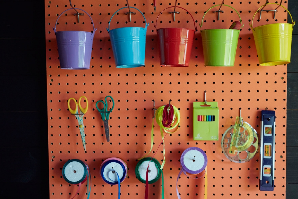
The other crucial thing to think about when designing a compact workspace is storage. I like to have a good system in pace so everything is close to hand. A peg board is such an old classic but brilliant way to keep tools displayed. And I like the way the idea is nicked from the He-Shed! I’ve also added colourful storage buckets to keep bits and bobs in.
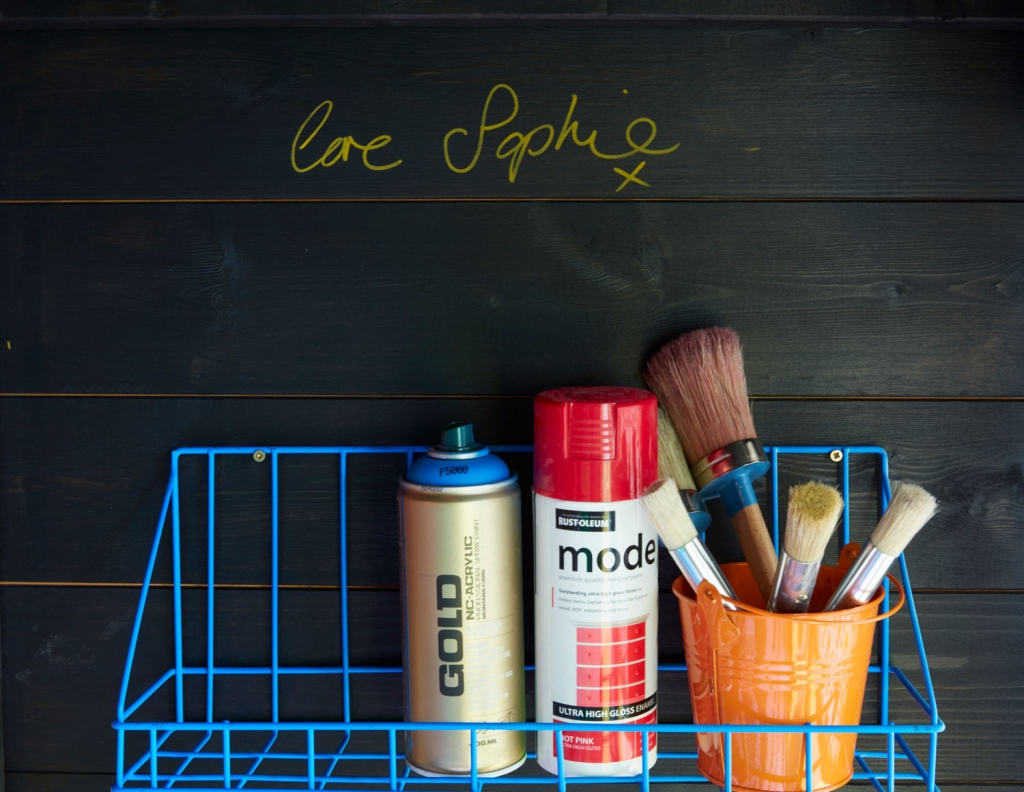
Wire shelves are a great solution in small spaces as they help create the illusion of space as the eye can travel through them. I’m loving the industrial edge of these wire shelves from Rockett St George. However for a more budget option I picked up some affordable ones from Tiger and sprayed them up in neon brights which is so quick and easy to do.
Finally you’ll want to think of lighting. If your she-shed is not hooked up to the mains (this will need to be done by a professional) then you can but battery lights. I’ve gone for an exposed bulb and neon pink flex from Dowsling and Reynolds as I love the way it contrasts with the dark walls and it gives off plenty of light in a small space.
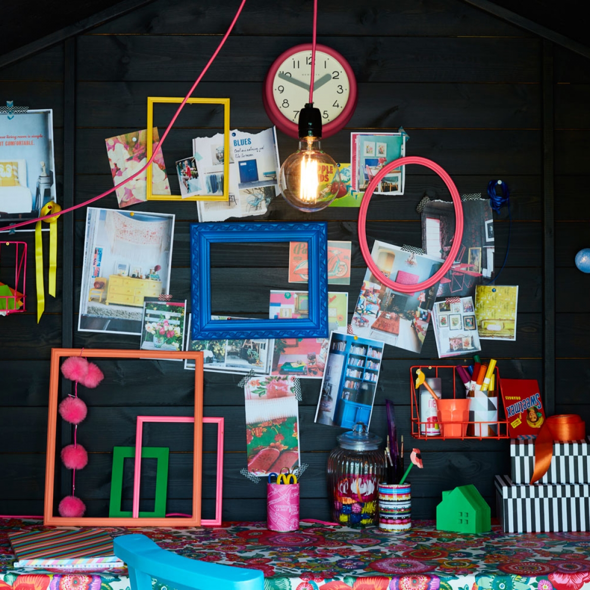
Then its time for you to add all your accessories. I’ve made an inspiration wall at the back of the shed to pin favourite images and items. It’s like mt very own live Pinterest board. I’ve styled a collection of junk shop frames again in the signature colours that make up the bright palette that I continue around the space.
COMPETITION TIME!
Now all of this is up for grabs. Hillarys is giving away the She shed and its contents and you can be in with a chance of owning a piece of Sophie Robinson design by entering here. PLease feel free to share this post with anyone who might need a little bit of She Shed loving in their life!










 proof that your landing de

