How to introduce colour in your home

If I have one mission in life it’s to get people to invest in making their homes more colourful because I know it unlocks a happy home. While I appreciate for some people, grey or beige is indeed Nirvana, I refuse to believe that for the majority of people this is true. The swathes of greige are more likely because people are afraid or don’t know how to do anything else. It’s why I enjoy running my Colour workshops so much, as I get to see the life-affirming moment when people discover what colours they love, that lift them up, and that work together and that are perfect for them. Not the neighbour, not the mother-in-law and certainly not just for the Instagram grid. If this sounds like it’s just what you need, sign up to my next workshop in Brighton on June the 13th, details here and I promise you’ll find it mind-blowing just how powerful getting connected to colour is. Meanwhile, before you clutch for the Elephants Breath, read on, here are my sure fire ways to easily and effectively add colour to your home.
Tap into the feeling
Choosing a colour, let alone the tone of that colour, can be overwhelming. There’s not just blue; there’s sky blue, baby blue, navy…the list goes on. The best question to ask yourself, is ‘How do I want this room to feel?” Colour is a massive mood changer and different tones of the same colour can create very different feelings. If you want a warm, cosy living room, look at colours with yellow and red tints in them. It doesn’t have to be the obvious earthy tones, a blue like teal is a warm hue because of the yellow undertone. In contrast for a starker, more dramatic look, opt for a clean colour like bright cobalt blue or a sophisticated cool navy.
Add accessories
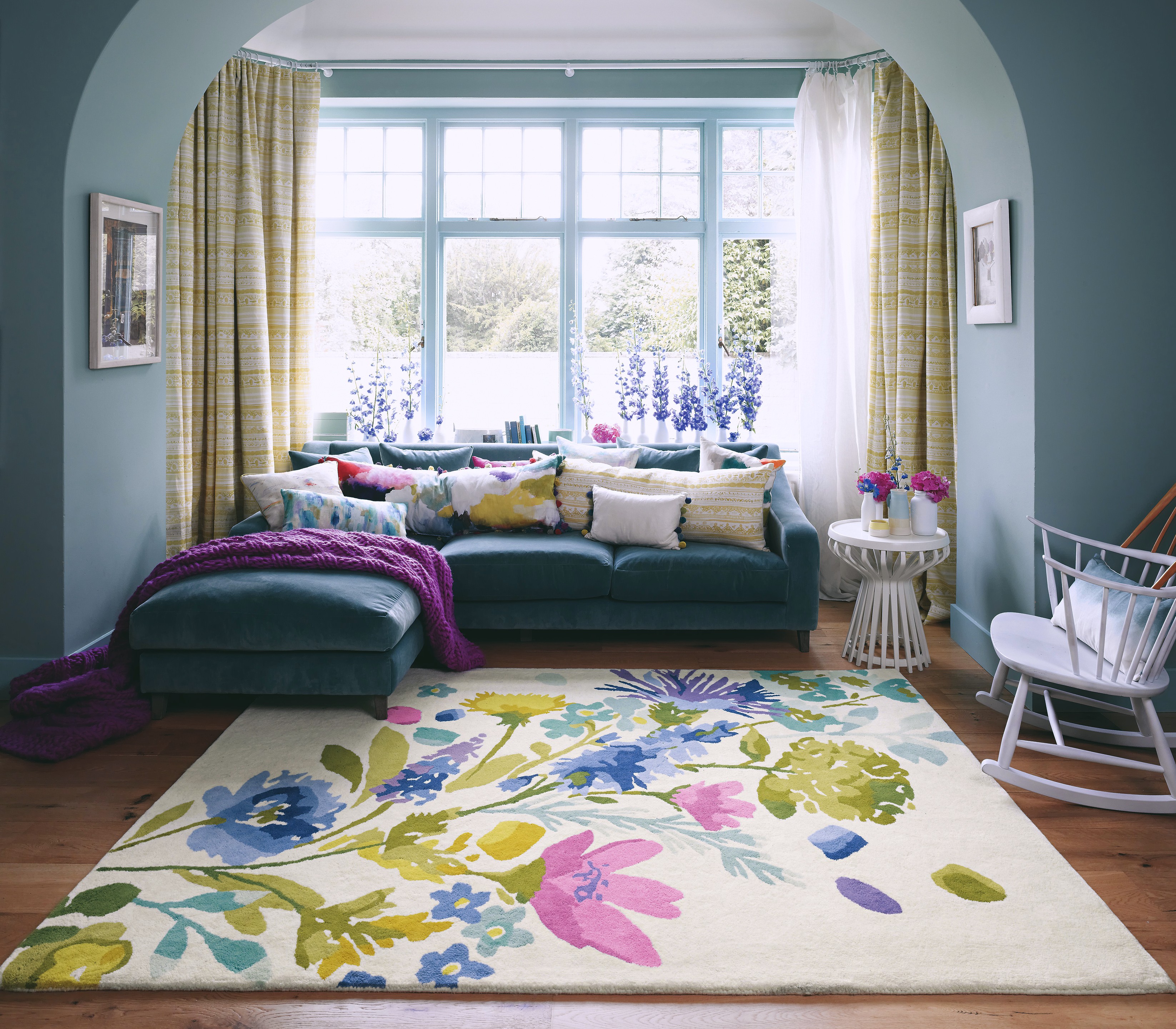
For the faint-hearted, I often suggest going neutral for the big ticket items like the sofa, flooring and curtains and then adding the colour with accessories. A bold feature floor rug (the largest you can afford), brightly coloured lampshades (switch up those shop bought cream ones), scatter cushions (you can never have too many) and wall art all combine to make an interesting colour scheme- but can be easily changed and updated over time.

An accent rug and scatter cushions can provide colour, pattern and personality to your interior as shown in this room designed by Bluebell Gray
If in doubt, just paint
The most transformational yet cost effective way to update your home is in a pot of paint. I’m serious, for the price of a tub and a weekend with a roller in your hand you can totally transform the look, feel and vibe of your room. My mantra is just go for it, it’s only paint and with Spring being the season for bank holiday weekends it couldn’t be a better time to decorate! Check out my video on how to choose a paint colour here.
Think outside the box
Use colour in unexpected ways. I’ve got a thing at the moment for painting the doors in my house surprising colours because it just makes me smile. Especially if the colour is yellow. But why not start off with a bold new hue for your front door. Nothing gives a great first impression than a bonny bright colour, so don’t be afraid to stand out.

Dare to be different with your colour options. Stairs painted in Trumpet by Little Greene
Create a cohesive colour palette
Stick to a cohesive colour palette and use this as your basis to design all the rooms in your home so there is some flow. While you’ll want each room to be different it helps if they work as a set. It’s really important to dig deep and work out which colours and hues resonate with you. This is at the core of my colour workshop as once you have discovered your colour palette and how to combine colours that sit harmoniously you are unstoppable. If you’re stuck on where to start you can begin by looking in your wardrobe to see the colours you naturally pick out.
Start with a swatch
I often start with a colourful wallpaper swatch or a fabric sample to build a colour scheme around. You’ll find a combination of colours which all sit nicely together, from neutrals through to brighter accent colours. You can use the pattern as your colour palette picking out different colours for walls, upholstery and curtains.

This Flowers of Thorpe Rug from Alternative flooring was pivotal in pulling together the colours in this bedroom scheme I designed. Photography by Alun Callender
Think in threes
I find that three is a bit of a magic number when pulling a scheme together with the hero colour being around 60-70% of the scheme (think walls, floors or large pieces of furniture) then the secondary colour being around 20-30% (for example soft furnishings) with the final accent colour around 10-5% (that’s cushions, artwork and vases). You can add neutrals in with this, I call them a free colour, and can be found in wood flooring and furniture for example.
Create a mood board
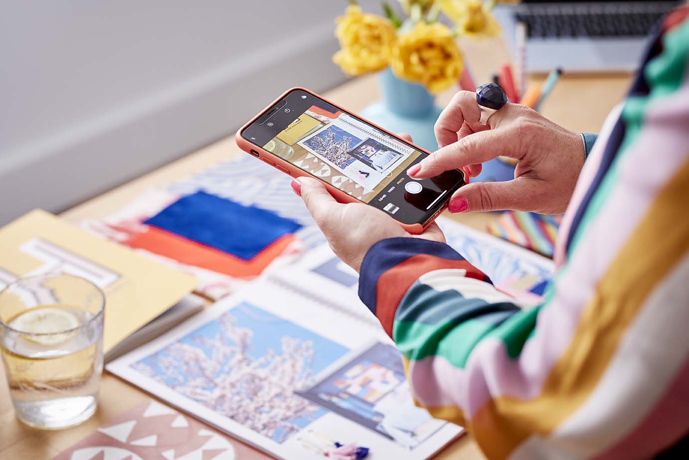
Before stocking up on paint, compile a mood board. You can start on Pinterest, but don’t plan everything online. Call in some colour cards because they can look completely different on the Internet, and remember that colours form relationships with other colours, so it’s important to print off pictures of your rug, sofa and so on, put them all on one sheet of paper with the colour cards and make sure they sit nicely together — that’s where the skill is.

Guests on my colour workshop learn how to create colour schemes through mood boarding. Photograph by Katie Spicer
Just do it
Worrying about what other people will think of your interiors is “insanity”, and my biggest piece of advice is to “go with your gut.” Some people look at rooms that I design and think they’d give them a complete headache. I don’t get offended by that. It’s just not for them. It’s impossible for everyone to like everything you do anyway because we all have different tastes. Do what you want in your own house and enjoy it. You’ll only be disappointed if you don’t!
Come join the colour revolution
For a space on my exclusive Ban the Beige colour workshop follow the link here. It’s an enjoyable and informative day packed full of unleashing creativity, discovering your own sense of style, pulling together your own colour palette and leaving you ready to design your house with ease. And the whole event is held in an inspirational venue, delicious food and the best company guaranteed.


