Diversity in design, colour expert Marianne Shillingford and kitchen revamp Podcast show notes S7 Ep5
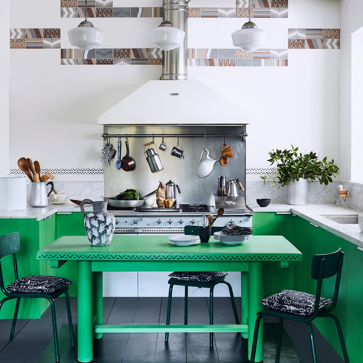
In this episode Kate and I discuss diversity within the British interior design community, we talk to colour expert and trend forecaster Marrianne Shillingford and share our tips and ideas around refreshing your kitchen decor. Here you’ll find all the links and useful images to support the show.
As always a big thank you to our sponsor Geberit for supporting the series. You can listen to the full episode here
Wow, what a week. This episode of the podcast goes out just two weeks after the death of George Floyd who was killed on the 25th May 2020 in police custody in America. His unjust death has sparked a protests around the world, fighting for racial equality and that not all lives matter until #blacklivesmatter.
So what does this have to do with an interior design podcast? It has been an extraordinary time for many of us to stop and think about our attitudes to racism and equality. We are responding to the call for us to be anti-racist and consider what that means and how we can be part of the change. I can start by looking in my own back yard and that is the interior design community. Kate and I felt we would bring the conversations we are having around the kitchen table to the podcast, and here we are.
Does interiors have a problem with diversity?
The short answer is yes, and we want to start by apologising for not addressing this topic sooner. However we wanted to begin by listening to the stories and experiences of Black, Asian and Minority Ethnic voices; designers, editors, commissioners, stylists, bloggers and influencers, who all make up the wonderful world of interiors. Now is the time to withhold our opinions and resist rushing in with quick-fix solutions. So for this episode we pass the mic in order to start a conversation, with the intention that these conversations lead to more off-line conversations and onto significant change.
We reached out and were astounded at the response, especially from people who have never spoken on this subject before. The recent events have been very provocative for everyone so we are particularly grateful that so many people shared their views and often painful experiences at this time.

Designer Eva Sonaike has a UK based luxury homeware brand the sells internationally, drawing on her Nigerian heritage and love of colour
You can check out the great design accounts behind the voices here:
Gemma Samuels @happihabitat
Melody @architravelmel
Angie @somethingbluehome
Decor by Delali @decorbydelali decorbydelali.com
Poonam Sharma @modernluxeblog modernluxe.co.uk
Terian Tilston @teriantilston_interiordesign teriontilston.com
Rukmini Patel @rukminipatel rukminipatel.com
Read Rukmini’s blog post about diversity here
Sarita Sharma @saritastylist saritasharma.co.uk
Jecks Stone @personaabode personaabodeinteriors.com
Eva Sonaike @evasonaike evasonaike.com
Camellia Odojukan @mrsodojukan
Bhavin Taylor @ bhavintaylordesign bhavintaylordesign.com
Busola Evans @busolaevans livingetc.com
Michelle Ogundehin @michelleogundehin michelleogundehin.com
Read Michelle’s blog post discussing diversity here
Charmaine White @twhinteriors thewhitehouseinteriors.com
Simon Hamilton @sihamilton747 simonhamilton.me

Interior designer Bhavin Taylor enjoys encouraging his clients to make bolder colour choices

Interior designer Rukmini Patel creates colourful interiors that are stylish and unique rukminipatel.com

Poonam Sharma is a successful blogger and Instagrammer who shares her stunning home on her account @modernluxeblog
Interview with Marianne Shillingford
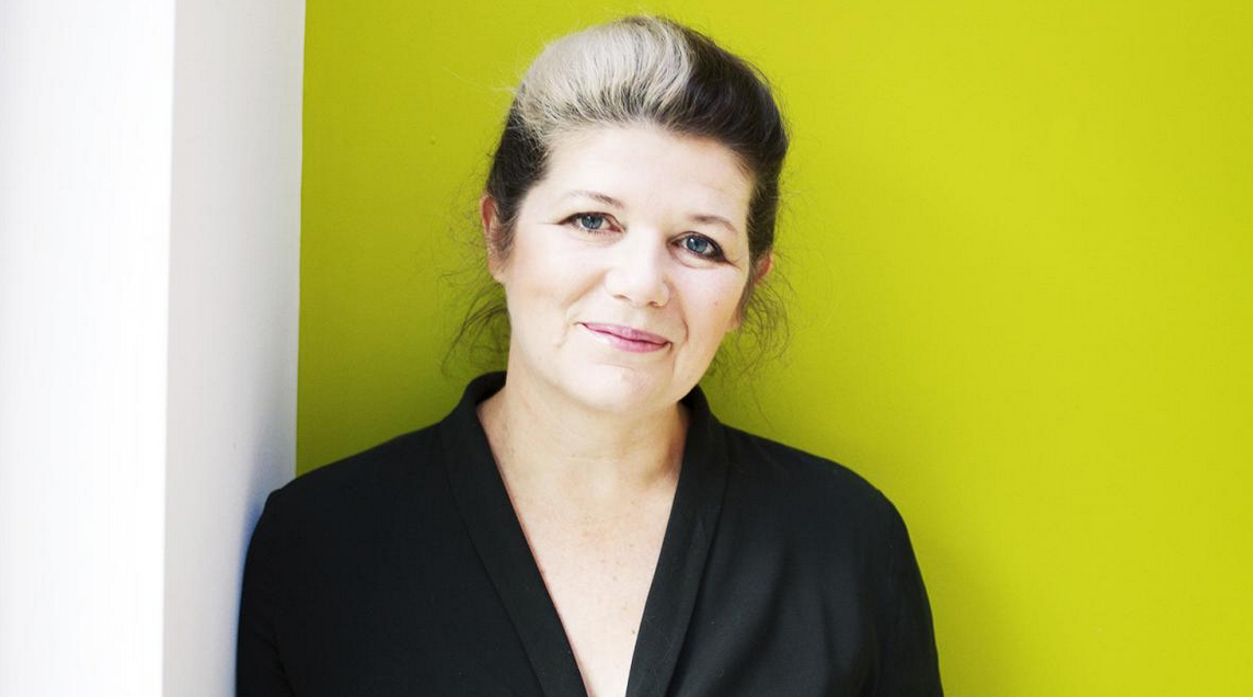
Marianne has, like me, been around the design block, and I first met her back in 2005. With a career spanning 25 years, she studied Fine art, ran her own interiors company, was artistic director of the National Design Academy, before venturing into journalism and TV. Finally, she’s found her legs under one of the most exciting tables in the industry as UK Creative Director of colour megalith Dulux. As part of the global Colour Futures team, the very influential global colour forecasting branch, she has her finger on the pulse of what the best-dressed walls will be wearing a full eighteen months in advance of the rest of us.
She also founded the Colour in Design Awards to encourage a new generation of designers and her passion for this industry is indeed infectious!
“I founded the Colour in Design awards which recognises and rewards great use of colour in design and it’s all about young, new people coming into the industry. In the last couple of years, I have to say I have seen more people with a greater diversity of background, although there still aren’t enough people with a story to tell of their culture and background. Although something is happening out there, there is greater confidence and think about it, the riskiest thing a young person can do with their future is to invest all their time and money in a precarious industry likes ours – it takes confidence, and it’s our job to help this next generation.”
The awards were launched to celebrate the use of colour in design and the talent of emerging designers. Also to show that colour is not just an aesthetic element of design, rather it’s a fundamental element. Through these awards, it has enabled Marianne to meet hundreds of new designers who are pioneering the use of colour to change the outcome of design in a positive way. Any graduates that would like to enter, you can find out more here.
Colour confidence
Marianne offered advice for those who are less confident about using colour and the barriers they find themselves behind.
“One thing we find easy to do is to buy small things that we can move around the house, but when it comes to committing to one colour that’s when we get scared. If you look at the small things, a piece of art, a beautiful cushion or something you’ve had for years, that’s where that magic colour lives. Use a colour picking tool like the Dulux Visualiser to be able to pick out the colours of those things you love and seeing them on the walls is where the journey starts.”
I know many people feel the fear when considering a strong colour, so the Visualiser sounds like a great tool. When it comes to dark colours, I often see people cop-out of making a full commitment and I loved Marianne’s analogy “you can’t be half married”. It’s a commitment!
How do you want to feel in a room?
This is at the core of a successful scheme and the question I always start with and it’s at the core of Marianne’s design philosophy too. She thinks that more and more of us are finding it difficult to sleep during these turbulent times of a global pandemic, so if you are decorating why not surround yourself in colours that help you relax, feel restored and help you reach a deep sleep.
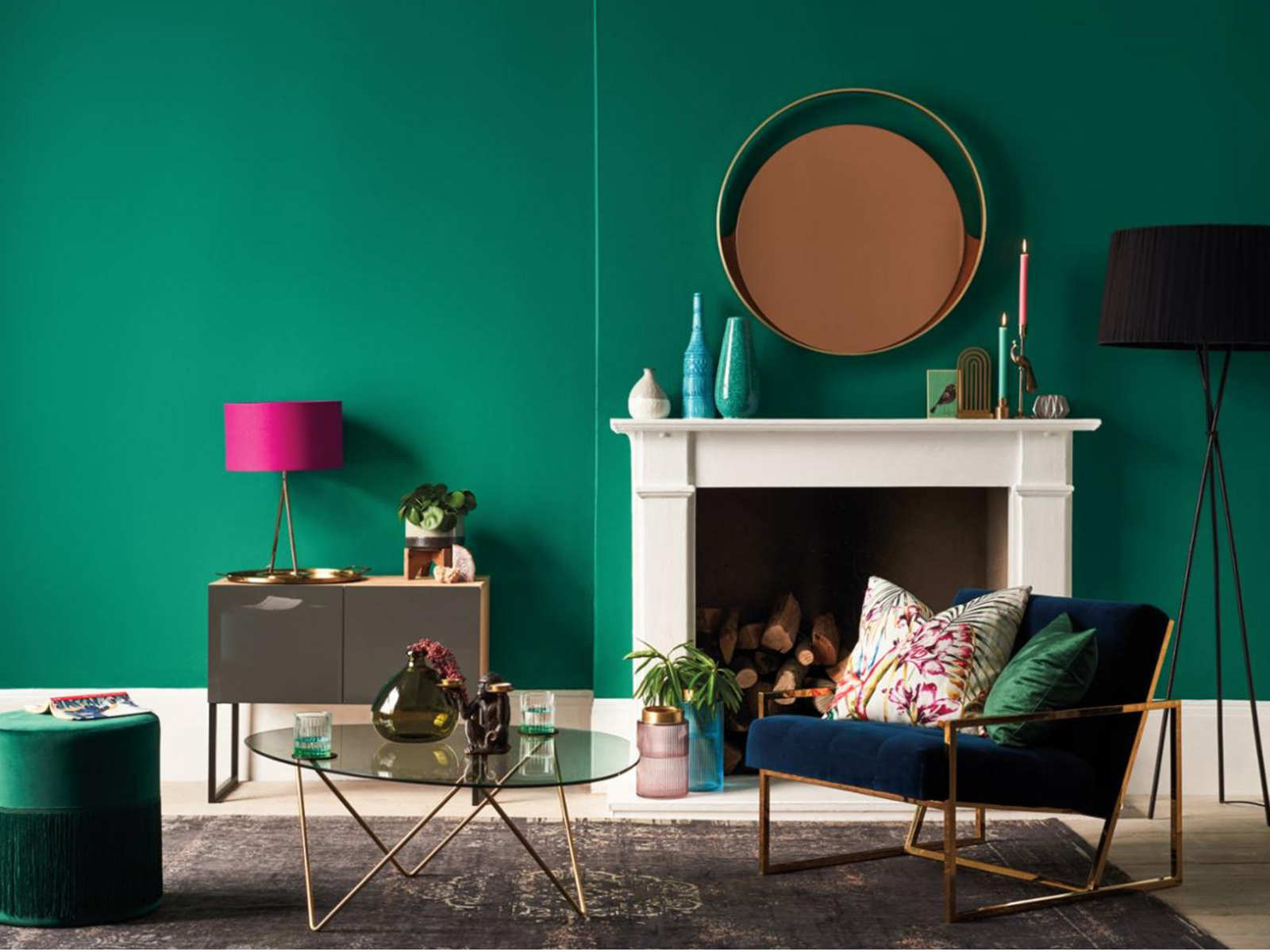
The rich jewel tone Emerald Glade by Dulux is the perfect shade to feel relaxed, restored and nurtured
If you find it hard sleeping (like my Tom) what are the best colours to use? Marianne suggests:
“Colours of the night, colours of the forest, deep emerald green, inky blues and deep dark greys where there is no visual stimulation of colour. It’s all about using colours that don’t stimulate, some colours demand attention and you’ll find it hard to concentrate on anything. For some, it’s about the tranquillity of soft biophilic green and beautiful colours that blur the indoors and out and for others, quiet colours are dark colours and you can combine these by having a deep dark green like Emerald Glade by Dulux.”
Marianne works at the core of colour forecasting and is on the panel to settle on the hotly anticipated Dulux Colour of the Year. The colour is chosen a year and a half in advance and is a reflection of what we all ‘need’ from a colour emotionally. I wanted to know if the pandemic, which seems to have shaken the whole world upside down, is going to make the team desperately change tack. Marianne comments:
“The most important influence on trends is the human condition – what do we want and need from our homes? We started to see, global pandemic aside, a return to the familiar and return to nature and reconnection to things that make us feel safe and secure in an increasingly digital age. We are seeing a return of the softer colours in nature, think about where you would like to stomp off to after an argument – the countryside, hide in the forest – where you want to dream and relax. These beautiful organic colours, trends are reflected in how we are coping with what’s happening to us.”
So the colour of the year for 2021 is still on track and Marianne thinks that we will come out of this pandemic with the same worries but we may have more care, love and attention to all the details as we have enjoyed them, we’ve enjoyed the peace and cleaner air. So my money is on another green shade!
Kitchen revamps
So how do you give your kitchen a fresh up-to-date look? We have talked about painting cupboards plenty of times, but as a recap, as it’s a great way to the kitchen a facelift and if you can add more colour then I’m all for it. I’ve noticed there are so many fab makeovers on our Facebook group that I had to share the love. They have gone to the dark side, we’re talking, black, navy and inky shades.
Painting cupboards:
- For a traditional/rustic kitchen – go for Chalk paint. Annie Sloan recommends allowing the finishing lacquer two weeks to cure.
- Use a great undercoat like Zinsser – it can go on a multitude of surfaces without any need for laborious prep. You can then put any colour of your choice on top.

The fabulous and work-in-progress painted kitchen of Elizabeth Buckeridge I spotted on the Great Indoors Facebook page. I don’t care if she can’t reach the books to read Kate, it looks awesome.
Another place to make a difference is on the floor, not always the easiest as it depends on what’s down already. Often sneered upon but there are some fabulous vinyl flooring designs out there, check out Harvey Maria, Atra and Amtico. We also discussed painting or stencilling your existing floor with chalk paint. Here is the design that Kate mentioned that stylist Marianne Cotterill did for Annie Sloane using her chalk paint and a dinner plate. Genius!

Painting tiles with a dinner plate by Annie Sloan and styled by Marianne Cotterill
Huge thanks to Marianne for her uplifting and insightful input, always such a pleasure. Thank you to our fab sponsors, Geberit, our producer Kate Taylor and to you, our lovely listeners. Please feel free to pepper our podcast review page with your positive vibes and why not come and join the private Facebook page at The Great Indoors Podcast.
If you’ve been affected by the recent events surrounding #blacklivesmatter, here are some places where you can make a difference by donating:
Here in the UK
In the US
comments
Another varied and interesting post! Thank you for sharing so many great new BAME accounts to follow.
It’s nice to hear that in the design industry is open to all colours and create a community that allows best ideas to be seen.


