Colour scheme for a colourful and cool nursery

It’s Easter and with all things springs it’s a time to celebrate the change of season. I love this time of year, the sunshine comes out of hiding to warm up the soil (and hopefully dry out the mud!) But above everything its an exciting time of rebirth and new beginnings. I love the new optimism that spring brings, signaled by the perky little flowers that start popping up everywhere. I’m seeing snow drops, primroses and daffodils beginning to pop up everywhere but it’s when the blue bells start to appear that I know we’re well on our way!
So with the spring vibe in mind, and celebrating birth and rebirth I thought I’d celebrate this nursery scheme I designed. (Currently on show at The Ideal Home show in Olympia until the 2nd April- so catch it while you can!) There is no room that’s loaded with excitement and delicious expectation like a nursery for a new born.
For anyone who’s attended any of my Colour Psychology workshops or read the blog posts then you’ll know that decorating in the ‘Spring’ colour palette and style is just perfect for small ones spaces. The warm buoyant colours, the busy patterns and joyful cutesie vibe is just perfect for creating a space for young folk.
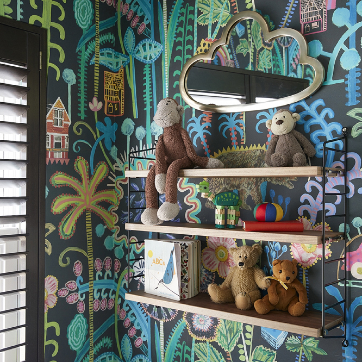
So when it came to pulling together a colour scheme for the Ideal home show I my starting point was this incredible wallpaper by designer Lucy Tiffney. I’ve been a massive fan of Lucy’s work ever since I met her on the Great Interior Design Challenge. She has a wonderful freehand quality to her designs which I adore as it helps create that homely vibe, which my designs are all about. I also love the fact it has this very dark and sobering back ground. As its a bedroom, I wanted to create a space that would feel cosy and cosseting in order to help baby sleep. And I just love the way brights look against the dark backdrop. Coupled with the dark walnut shutters from Hillarys, you should have no problem with day time naps.
Next up my co-designer Edwina Boase set about sourcing furniture for the space. She found this wonderful childrens furniture website Cookooland furniture for the cot and chest of drawers, which is deep enough for the baby changing station. I also love the warmth of the walnut inside this dark scheme. If you have a small room like this, keeping it close in tone, is a great idea and helps the room feel more spacious.
This is a maximum commitment look. I’d argue you need to take this wallpaer on all four walls to create the immersive effect. And a bright bold carpet completes the look. Continue to ban the beige folks!
CREDITS
Mr.Bear wallpaper extra wide by Lucy Tiffney www.lucytiffney.com
Woodwork painted in Basalt by Little Greene www.littlegreene.com
Spectrum carpet in Spectrum 83 Kingfisher by Hillarys www.hillarys.co.uk
Black walnut shutters by Hillarys www.hillarys.co.uk
15” big lamp in yellow pendant, by Cable and Cotton www.cableandcotton.com
Switches and sockets in black and brass by Dowsling and Reynolds www.dowsingandreynolds.com
Cot and chest of drawers in Harper Herringbone by Cuckooland.com
East coast coil mattress by Wayfair www.wayfair.co.uk
Rainbow cushion by Me and Anna www.meandanna.com
Rainbow fairy lights by Cable and Cotton www.cableandcotton.com
String shelving www.string.se
Cloud Mirror, www.laredoute.co.uk
Polko Dot vases, www.audenza.com
Leopard Standing Vase, www.audenza.com
Cloud Rug, www.laredoute.co.uk
Ceramic Giraffe, www.habitat.co.uk
Yellow metal desk tidy www.laredoute.co.uk
Footstool Felix in Dijon www.sofa.com
Love framed artwork by Alex May Hughes www.alexmayhughes.co.uk
comments
This is so colourful and creative – just the perfect place for a toddler or child! Such a great share. Thank you for sharing all the links. Eoghan from https://www.yeshomebuyers.com/
What a lively nursery! I love all the bright colours, and especially the beautiful lampshade. Thanks for sharing!


