Colour Psychology and why it’s such a powerful interior design tool
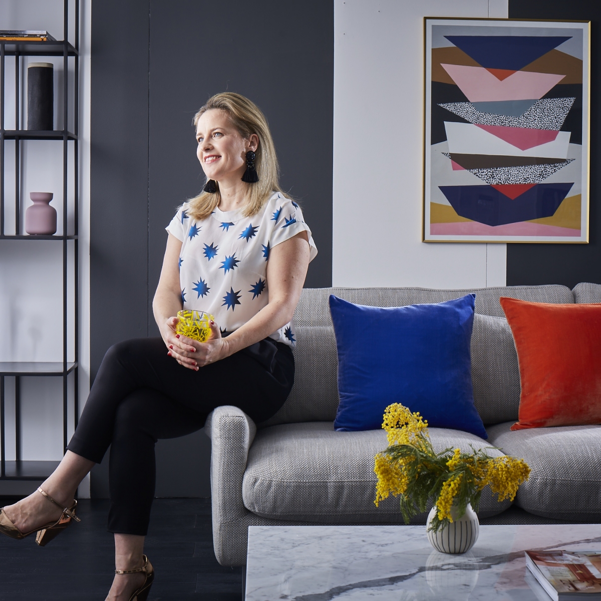
This week see’s the launch of a very exciting collaboration between me and one of my all time favourite high street brands habitat. I’ll do everything humanly possible to spread my love of colour and passion for original and authentic interior design, so I almost fell over myself when their PR team reached out and said they’d like to work with me on a Colour campaign.
Their interest had been peeked by the Colour Psychology courses they’d seen me blog about that I host with expert Fiona Humberstone. We run courses a couple of times a year for professional interior designers that uses Fiona’s clever framework, based on Colour psychology, as a tool to help interpret a design brief and yet more than that- create powerful schemes that will resonate with a client on a deeper more emotional level. Habitat were intrigued to see my take on it as a way to help people pull together design schemes for themselves. And of course I said yes, as #banthebeige is my mission in life!
But time to share what my take is on Colour Psychology and why I’m so excited to share it with you. It’s such a powerful way to help you pull colour schemes together confidently and with ease. In a visual world full of Pinterest and Instagram it’s a way to find a piece of clarity and design direction and stop the push and pull of lusting over other peoples pads.
Colour psychology is the brain-child of colour psychologist Angela Wright and I still to this day find her book, (published in 1995 so the pictures are rather dated!) A beginners guide to Colour Psychology deeply enthralling. Angela, studied psychology, and was fascinated by the psychological effects colour has on us. It’s so emotive, and not just based in science. For example science would have us believe colour is merely light waves. But close your eyes, and what do you see? Colour is all around us, effecting our mood, even when we sleep!
Angela recognised that colours have a positive psychological effect when in harmony with one another, and conversely really quite negative when they don’t. People think that it takes a special knack, some magical creative flair, putting colours together, but she devised a framework to make it almost fool proof (putting me out of a job!). Next by studying people she saw that they actually fell into four distinct groups and these groups reacted to colours in different ways. For example if you asked 4 people their favourite colour and they all said is blue- you might note that they could be talking about very different types; baby blue, teal, navy, electric blue. Actually the nuances of just one hue is multiple, you only have to look at a Dulux fan deck to see that. Angela divided people and indeed colours into four colour families Type 1, Type 2, Type 3 and Type 4. But as her understanding of the Colour personalities deepened she chose to call them Spring Summer, Autumn and Winter. Genius really because the colour preferences and energetic personality traits of each group mirrored the patterns in nature perfectly. It’s a great analogy and really helps to communicate quite a complex theory.
I’d had the privilege of working directly with Angela back in my magazine days, in the early noughties, when I styled four room sets for the magazine I was editor on, in the style of these four seasonal personalities. The idea being that once you have decided what Seasonal personality you are, then it makes sense to design and decorate your home in those colours and seasonal styles. What I LOVE about this is it’s giving you a deeper sense of your own individual design tastes and colour preferences, rather than just copying the trends or magazine pages. It’s giving you an individual sense of what colours make you feel most at home.
But it wasn’t until over 10 years later that I got reacquainted with Colour Psychology again, when I picked up Fiona Humberstones, must-read book, Style your Brand. In it she cleverly uses Angela’s Colour Psychology to create a powerful frame work for helping companies create knock out brand identities. Colour psychology is a great way to communicate ideas and feelings- which is what any successful brand needs to do in order to resonate with their customers. After attending her Colour Psychology for Creatives workshop (you can sign up for the online version here) I saw the perfect opportunity for Interior Design. Fiona’s framework, used to empower interior designers to interpret a design brief along with the theory of colour psychology to create design schemes that really resonate with a client, has resulted in our sell out Colour Psychology events that we now host twice a year.
So back to how Colour Psychology can help you. For the Habitat project we’ve kept it really simple yet really effective. First up they invited me to design and style four looks, or Colour tribes, as I like to call them, inspired by the Seasonal personalities, just like I did for the magazine I worked on all those years ago. I wish I still had an old copy, I’d love to compare the results! It was a great experience to be given the opportunity to create our very different looks using product from just one retailer which goes to show you how easily you can create your own sense of style. And better still this isn’t about interpreting the new Spring Summer trends and product launches. This is about creating your own timeless sense of style that you can then to go on and easily update.
The full reveal can be seen over on Habitats website here. So please do check it out and let me know what you think. Over the next couple of weeks I’ll be sharing more about this collaboration and how you can pick the right Seasonal personality for your interior in the next four posts, so stay tuned!





 proof that your landing de

