Anna & Peter’s open plan living space room – Dream Home Makeovers
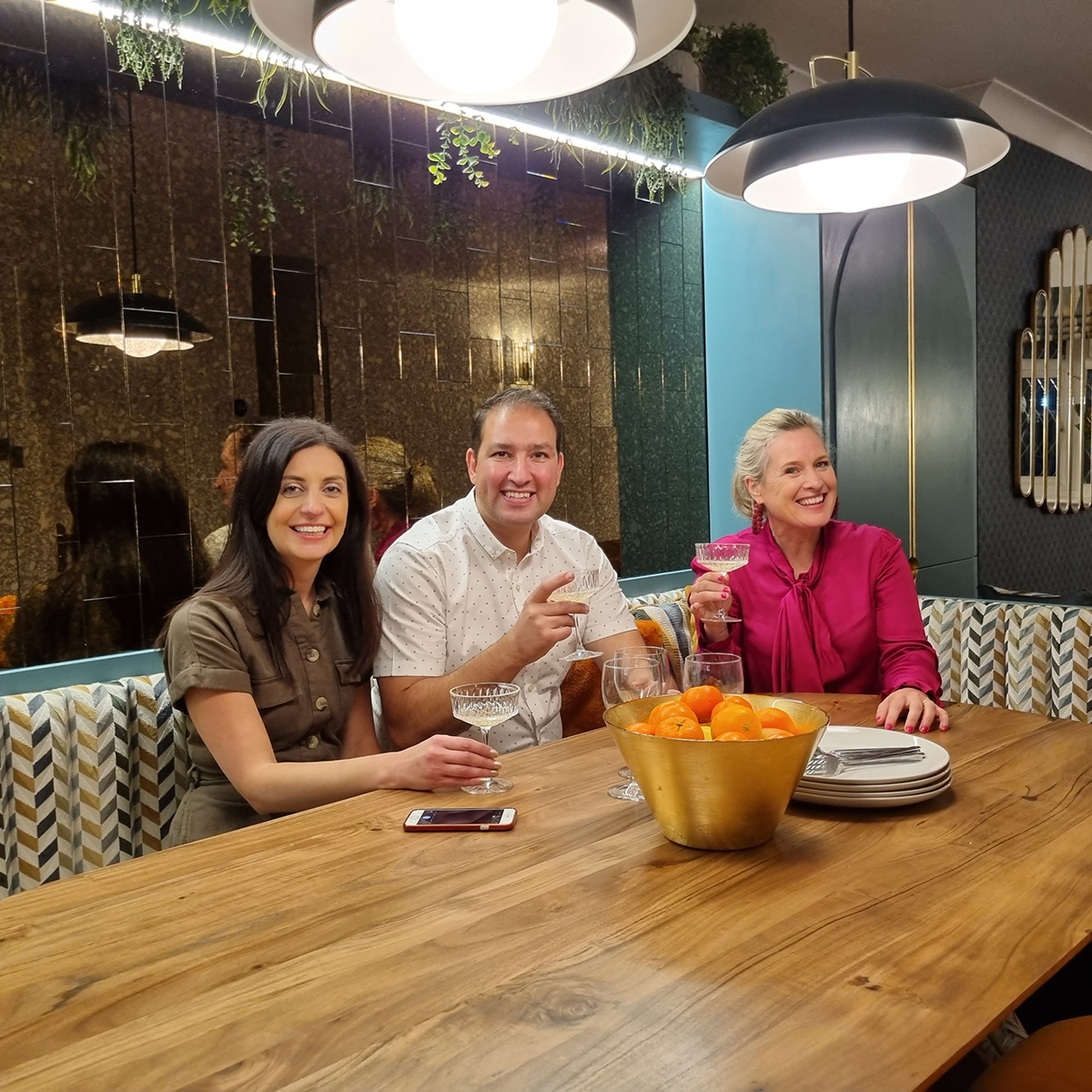
Anna and Peter possibly posed my biggest challenge because as clients, they really were lost at sea as to what colours and decor style they liked. I gave them home work to come back to me with any images or places they liked and felt inspiring, and all I got back was a list of Annas storage requirements! Its hard when you have no experience of interior design and have never fixed up a your own place before. Where do you even start?! Not with white walls Peter, not on my watch!
Spoiler alert, this post shares the reveal photo’s from Anna and Peters Dream Home Makeover. If you’ve not caught up on My5, look away now!
To get Anna and Peter in the headspace for design, and away from the spreadsheets, I took them for an inspirational day out to visit The Ivy restaurant in Brighton- because it has an astounding interior which I knew would at least spark a love it/ hate it conversation. This is what I advise all my online design school students to do- go out and look at art, design, architecture and start forming an opinion! Be aware of how a space makes you feel when you walk into it.
From our visit we were able to establish a few key words on the feeling Anna and Peter wanted to create. Ultimately a nice place for them to relax but the big drive was to create a vibrant entertaining space for friends and family. In terms of style the Ivy was too much for their aesthetic so I had to tone it down, somewhere between Maximalism and Minimalism and I felt a take on Modern Deco straddles these two aesthetics perfectly. It brings all the glam without the visual over load.
I also asked the couple for the colours, fabrics and finishes they like, and by showing them examples, this is the mood board we produced for them, based on some of the key words that came up in our conversations.
Now to tackle their open plan multi functional space!
Before….
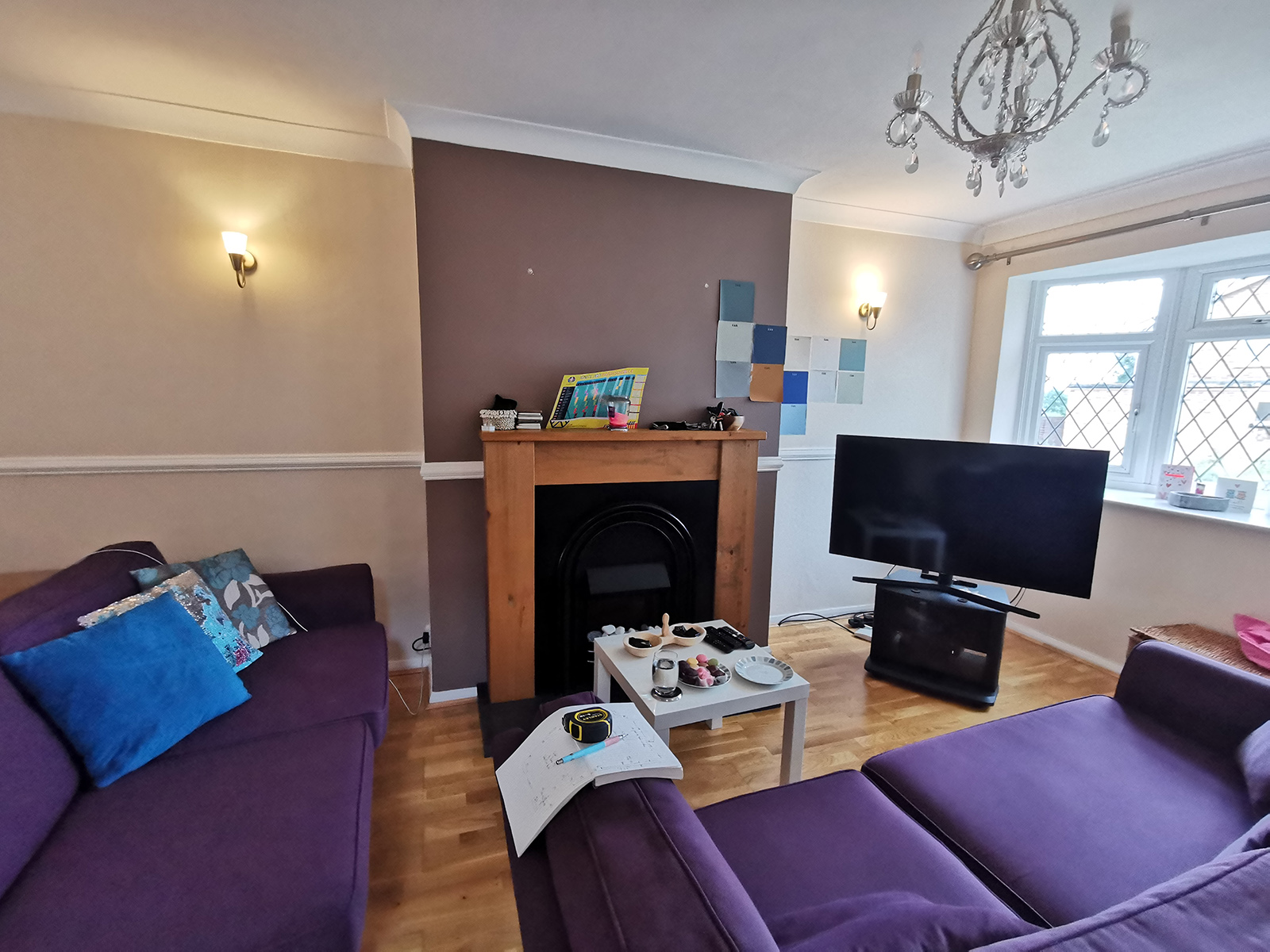
We recommended removing the faux dado rail and oversized redundant fireplace. This would help create a more streamlined and contemporary look in their 1960’s house.
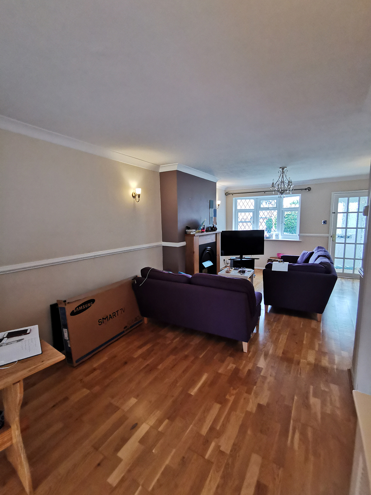
The couple did not have a stick of furniture for their new home. They bought their old purple sectional sofa from their old flat but it didn’t fir the space. And I need to have a solution for that huge TV!
We had to start with the floor plan for this room, as it was long and thin and dark in the middle. I worked with the talented Barbara Ramani, my co-designer on this project, to make sure we could fit in all the elements that Anna and Peter wanted- which was lots of seating for family and friends in a relatively small space. As there is no hallway, the area on the right hand side of the room had to be clear of furniture. At the top end was to focus around the Tv. For the central dining area, a fitted banquet seat was the perfect solution, providing lots of bums on seats and taking up less of the floor plan than a traditional table and chairs. And for the bar area, we intended to install 2 chairs for Anna and Peter to enjoy the view of their garden at the weekends and also a cocktail cabinet for when they throw parties.
After…
Here you can see how the layout fits seamlessly, making use of every inch of the space, yet still keeping an open and airy feel which was really important to the couple. Peter got to keep most of his beloved white walls, but we added a rich teal on the feature wallpaper and fitted joinery. We introduced burnt orange to the furnishings which contrasts dramatically.

The long open plan space is now neatly divided into three distinct areas, with lighting positioned to highlight each zone. All woodwork and walls in white mist, both emulsion and eggshell, Dulux. Wallpaper Marmaris Peacock, Rebel Walls. Fitted storage unit painted in Stonewashed, and Teal Voyage, Dulux
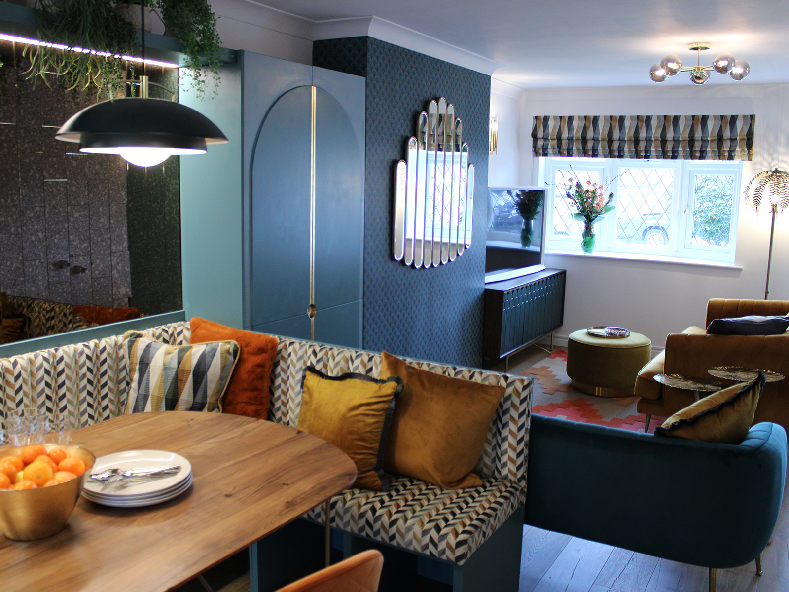
The fitted banquet seat creates a subtle room divide while still allowing the space to feel open and airy. Bespoke upholstered Banquette fitted seat, made by Poh Maluna; Upholstered in Katori Arzu tamarind, Romo
The dining room are lacked natural light but a wall panel of bronze foxed mirrored tiles bounces the light around and visually doubles the space. It also has that nod to Art Deco glamour. While Anna and Peter didn’t want any ornaments or nik naks, I twisted their arm to have these faux potted plants to soften the hard lines.

The mirrored tiled panel above the fitted seating reflects the light around, and visually doubles the width of this narrow part of the room. Busca bronze tiles, Topps Tiles
The fitted banquet seat was an absolutely genius solution to this small area. An idea inspired by restaurant design they are great for saving precious floor space. We worked out you can fit up to ten people around this table for when the couple throw a party. While it took up a big part of their budget it really elevates the space. I selected a luxurious patterned velvet for a chink of pattern that was not visually too overwhelming- and very practical too.
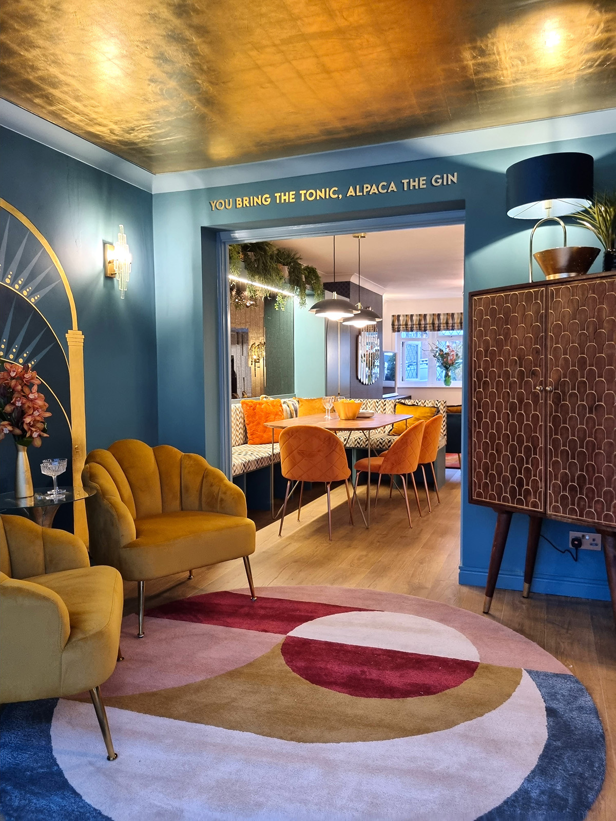
The gilt ceiling and bespoke typography puts a personal stamp on the bar area and brings the glam in spades. Gold Leaf Ceiling and Mural, Daniel Bland and gilt typography by Carlie Allan. Paintwork in Stonewashed blue eggshell, Dulux Walls in Teal Voyage emulsion, Dulux
While each space had its own purpose it was very important that they all linked together with the same colour palette and design style. The simple modern Deco motifs of arches, fan shapes, and geometric prints worked a treat, coupled with the colour palette of teal blue, orange and gold. Choosing one metallic finish and continuing throughout also helps create cohesion.

Much of the furniture had sleek curved lines, which is indicative of the Art Deco period. Evelyn mustard velvet armchair, Cult Furniture
And who doesn’t love a gold ceiling! I was so thrilled to bring in the talents of Daniel Bland and Carlie from Buck and Bear to create a dream gilt mural in the bar area. I knew deep down that both Anna and Peter wanted a bit of glamour and while they were slightly terrified of the thought of a gold ceiling this bespoke mural won them round. Investing in something unique and hand made that only you can have, really helps make a home feel special.
Dressing room
The dressing room was Anna’s project and was the perfect room for her to finally experiment her wild side. The alcove area was filled with fitted mirrored storage giving her oodles of rooms to organise her clothes (Anna does love storage!). All that as left was a dressing table and occasional chair. But the wallpaper mural supplies the wow factor in spades! My argument is small rooms can take large scale patterns. Small box rooms struggle to look exceptional if left plain and sparse, so my advise is just go for it and make a bold statement with a large scale print, all the way around the room of course!
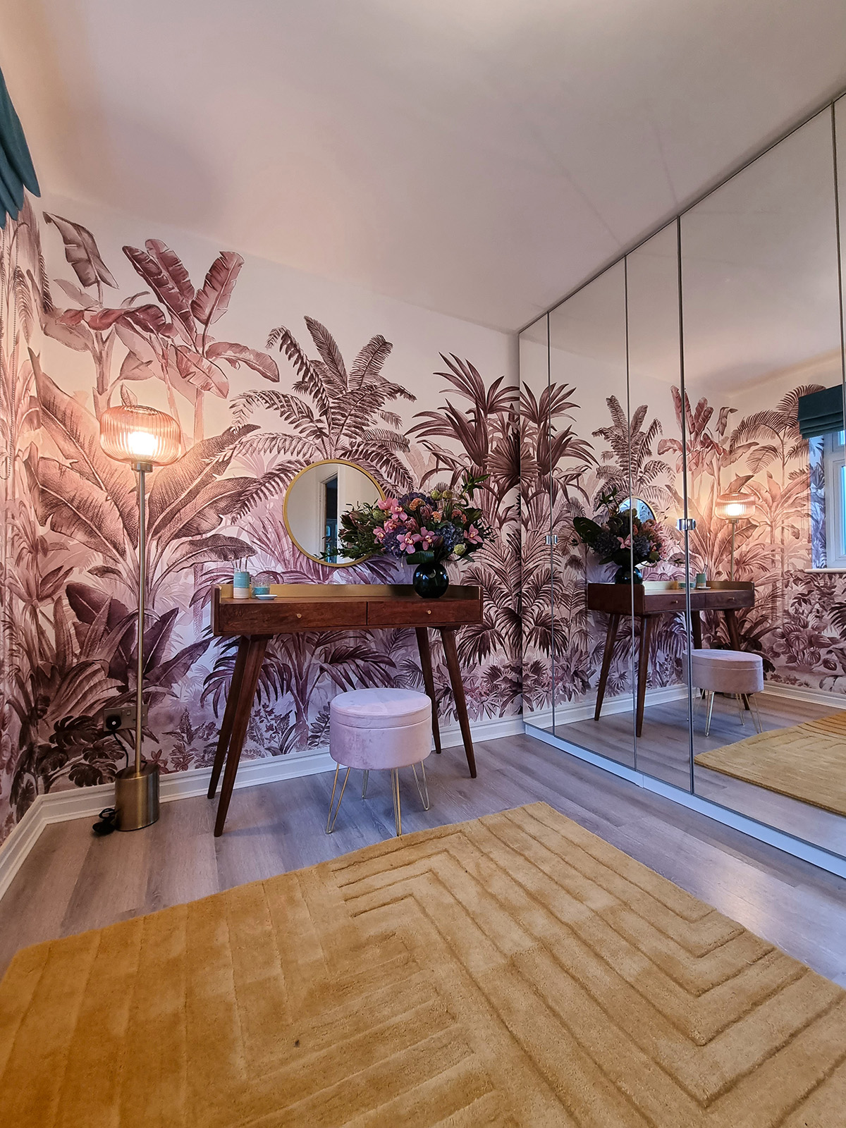
Pride palms wallpaper mural in plum, Rebel Walls. Walls painted in Timeless emulsion; Woodwork in Timeless satinwood, both Dulux .

The perfect place to get ready in the mornings. Dressing table, Amba HouseVelvet plush Pouffe, Etsy.com
You can find weblinks to all the products we sourced for Anna and Peters makeover below. And if you would like to learn more about how you can create your own dream makeover , do check out my online Interior Design School, with plenty of courses to help you create a home you love.
PRODUCTS FEATURED
LIVING AREA
All woodwork and walls Dulux white mist, both emulsion and eggshell, Dulux
Wallpaper Marmaris Peacock, Rebel Walls
Fitted storage unit painted in Stonewashed, Dulux, and Teal Voyage, Dulux
Furniture
Love Seat in Teal Velvet, Cult Furniture
Two Seater Enchanted Sofa in Cinnamon, DFS
Connie green TV Stand, Swoon
Gold Water Lily pad Table, Rocket St George
Hetherington Ottoman, Made.com
Accessories
Avon Deco Large fireplace mirror, Cult Furniture
Tray on Ottoman, Etsy
Lighting
Fern leaf palm tree Floor lamp, Rockett St George
Melville Wall Lights, Pooky
Globe Central Ceiling Light, Made.com
Soft Furnishings
Chevron Sienna Rug, Audenza
Cushion on cinnamon sofa, Tamarind 50 x 50, Romo
Burnt orange cushion, Audenza
Living room blind made in Katori Tamarind, Romo
Curtains made by, Bela, belairvanipour@hotmail.co.uk
DINING AREA
All woodwork and walls in White mist, Dulux
Busca bronze tiles, Topps Tiles
Furniture
Avon Deco dining table, Cult Furniture
Sylvia carver dining chairs in burnt orange, Cult Furniture;
Bespoke upholstered Banquette fitted seat, made by Poh Maluna; Upholstered in Katori Arzu tamarind, Romo
Lighting
Brunswick layered pendant ceiling light, Made.com
Soft Furnishings
Tamarind cushion, Romo
Faux fur burnt orange cushion, Audenza
Gold velvet and dark teal trim cushion, Cult Furniture
Accessories
Faux potted Plants, from a selection at Dunelm, and Homebase
BAR AREA
Gold Leaf Ceiling and Mural, Daniel Bland and Carlie Allan
Paintwork in Stonewashed blue eggshell, Dulux
Walls in Teal Voyage emulsion, Dulux
Ceiling undercoat in Honey Mustard emulsion, Dulux
Wallpaper Marmaris Peacock, Rebel Walls
Furnishings
Bascombe hand-tufted rug, Made.com
Furniture
Dejan 2 door sideboard (Bar cupboard), Furniture123
Evelyn mustard velvet armchair, Cult Furniture
Lighting
Skystar wall lights wall Pooky
Carmella table lamp, Made.com
Accessories
Black plant pot, Homebase
Cocktail glasses, Ikea
DRESSING ROOM
Walls painted in Timeless emulsion; Woodwork in Timeless satinwood, both Dulux
Pride palms wallpaper mural in plum, Rebel Walls
Furniture
Effie Rose pink velvet armchair, Cult Furniture
Dressing table, Amba House
Elements round Mirror, Dunelm
Velvet plush Pouffe, Etsy.com
Dressing table mirror, Oliver Bonas
Soft Furnishings
Cushion on chair, mustard velvet palm tree cushion, Audenza
Carved mustard wool Rug, Audenza
Roman Blind in Kensey Peking blue, Romo
Curtains made by Bela, belairvanipour@hotmail.co.uk
Lighting
Ceiling Light Globe large brass opal, Made.com
Textured glass Floor Light, Made.com
Pink tassel lampshade Made.com
Flowers
Flowers by Orchid Flowers




 After
From beige to boom! My bathroo


