Dulux Colour of the year 2020

The swanky London address, the cute canapes, and sumptuously styled top floor wrap-around glass setting drew a crowd of elite press media and heavyweight influencers all waiting for the big drumroll; the unveiling of Dulux Colour of the year 2020. I’m not going to lie, I often find these pronouncements of a singled out hero colour massively underwhelming but the story behind the trend, why Dulux, a global brand that pulls in colour experts and trend forecasters from around the world to ponder on what single colour we will be rolling on our walls absolutely fascinating. And do they always get it right? I’ve not seen too many interiors in last years ‘Spiced Honey‘, but as I say, I think it’s less about the actual colour of the year and more about the story. So are you sitting comfortably? then I’ll begin….
The headline opener is that ever-increasing advances in technology mean we are searching for meaning in this digital reality. It’s uncertain times indeed and with the onset of A.I and our fascination with social media profiles all forcing us to consider who we truly are, and indeed what we want and need. It turns out I’m not alone in feeling that the world is becoming forever fast and furious, chaotic and uncertain so Dulux proposes that we crave more balance, calm and structure in retaliation. There is also a massive up-swell in the whole ‘wellness’ trend across all genres and I’m particularly interested in how this is being picked up in interiors right now. We want to feel better in ourselves and look after ourselves and each other. There is perhaps no better place for that to happen than in our homes.
Marianne Shillingford is the effervescent Creative Director of Dulux who fronted the launch and spoke with passion and authenticity about how “Dulux Colour of the year captures how we want to feel”. And with that, the curtain dropped and #COTY2020 was unveiled. “ The colour is soft, calm and nurturing. The Dulux Colour of The year is Tranquil dawn.” I’ll admit my heart didn’t somersault with excitement but I did have a strong hunch it was going to be green so allowed myself to feel a little smug! It’s a quiet colour, almost a neutral as its just as much grey as it is green. Marianne comments “ Rather than creating a look around a sofa, we need to build a look around the person who owns the sofa.” And according to Dulux what the person needs is a calming grey-green and less excitement!
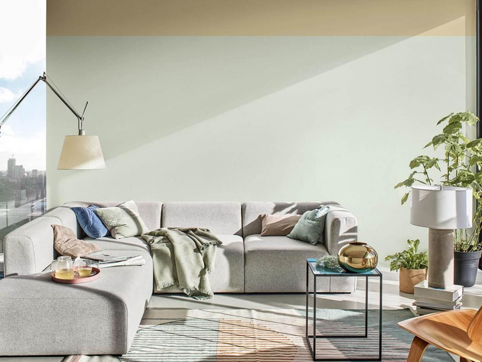
Tranquil Dawn connects our inside spaces with our outside spaces claims Dulux, and plays on the trend for all things wellbeing
The colour, in isolation, is not groundbreaking. It feels safe and almost familiar, and Marianne confirms that this was intentional. In uncertain times we crave the familiar and don’t need to be challenged by more newness in this sped up version of reality that we are living through. Tranquil Dawn is not intended to be shouty, shiny and groundbreaking. It’s the antithesis, it’s a feeling of home from home. Green has already been a massive story in interiors for the past few years but perhaps we’ve identified more of a lush hue to match in with the fascination with Biophilic design, veganism, house plants and botanical prints, all well established in our Instagram feeds. We want to nurture nature in our homes, and green is the colour of mother nature after all.
The fashion trend forecaster WGSN has nominated Neo mint as it’s colour for 2020 and my thinking is this is going to be a hugely influential, more of a refreshing spearmint than Dulux’s grey/green. As a colour, it has more energy and strength and perhaps feels more directional and thats more useful when it comes to fashion and product design. But a mass manufacturer like Dulux see’s their version of green shirking forward moving fashion and giving a nostalgic nod back to the softer celadon glaze greens. So which camp are your in? Neo mint or tranquil dawn. Is it all down to personal taste?
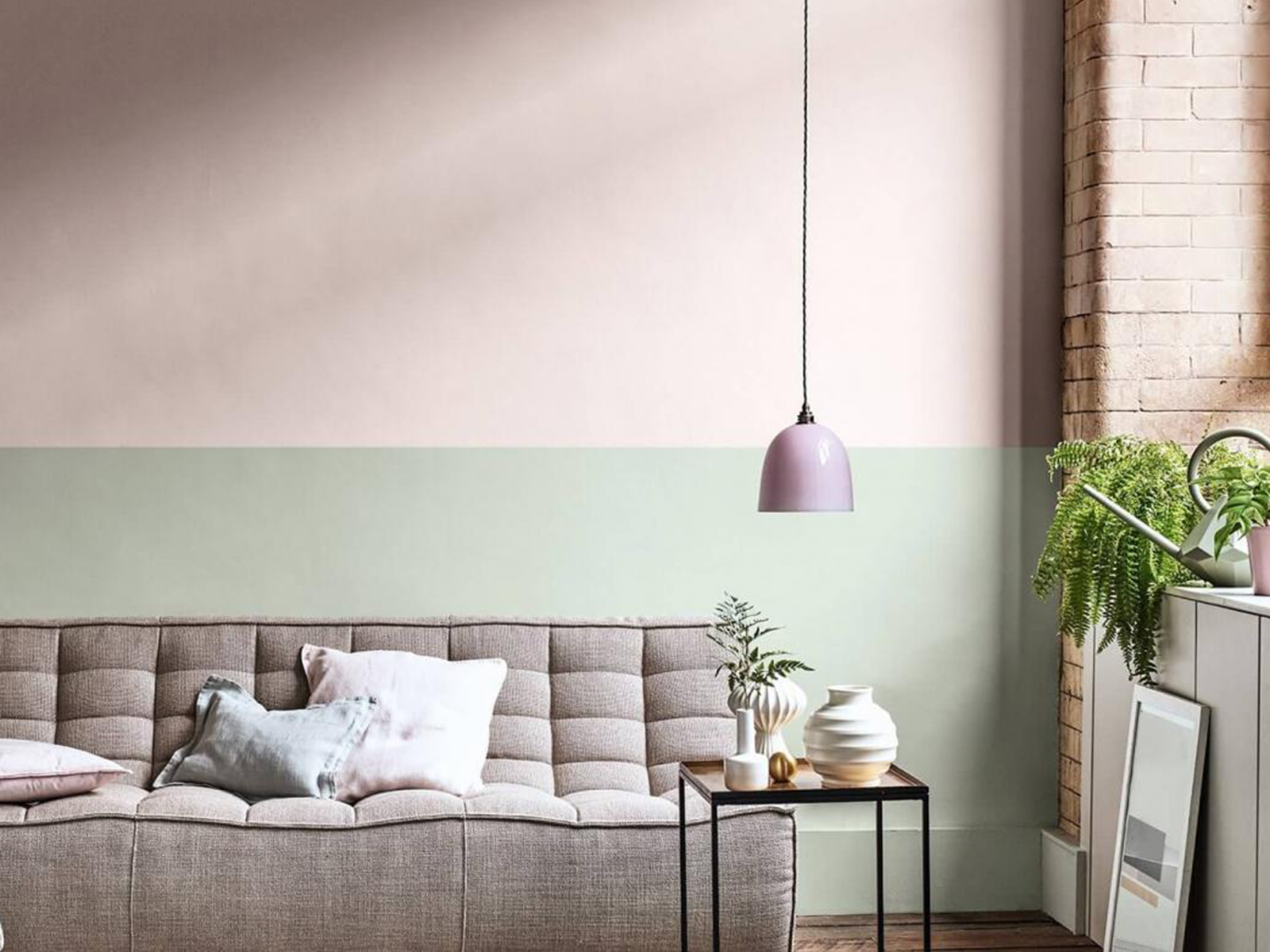
Just like the misty horizon that inspired Tranquil dawn Dulux predict horizontal line sin interiors to be another big trend when it comes to paint.
This is where colour forecasting can fall down as of course one colour cannot appeal to everyone and indeed a single colour effects people in different ways. One person’s tranquil is another person’s headache. I can’t see this particular hue coming to a wall in my home anytime soon, but thats not to say I don’t like it. It just doesn’t fit with my own personal palette. It also doesn’t mean it’s not a hugely versatile colour and the sentiments behind the choice I can get on board with. I can see it being used like a neutral against stronger more dramatic colours or bringing a little perky optimism to an existing all grey interior. It’s just that when I’m looking to colours that support me emotionally, make me feel connected to my best self then this colours is not my colour. So as I’m always saying, we can be interested in the trends, we can join in the conversation on how colour makes us feel, but we should never be slaves to them.
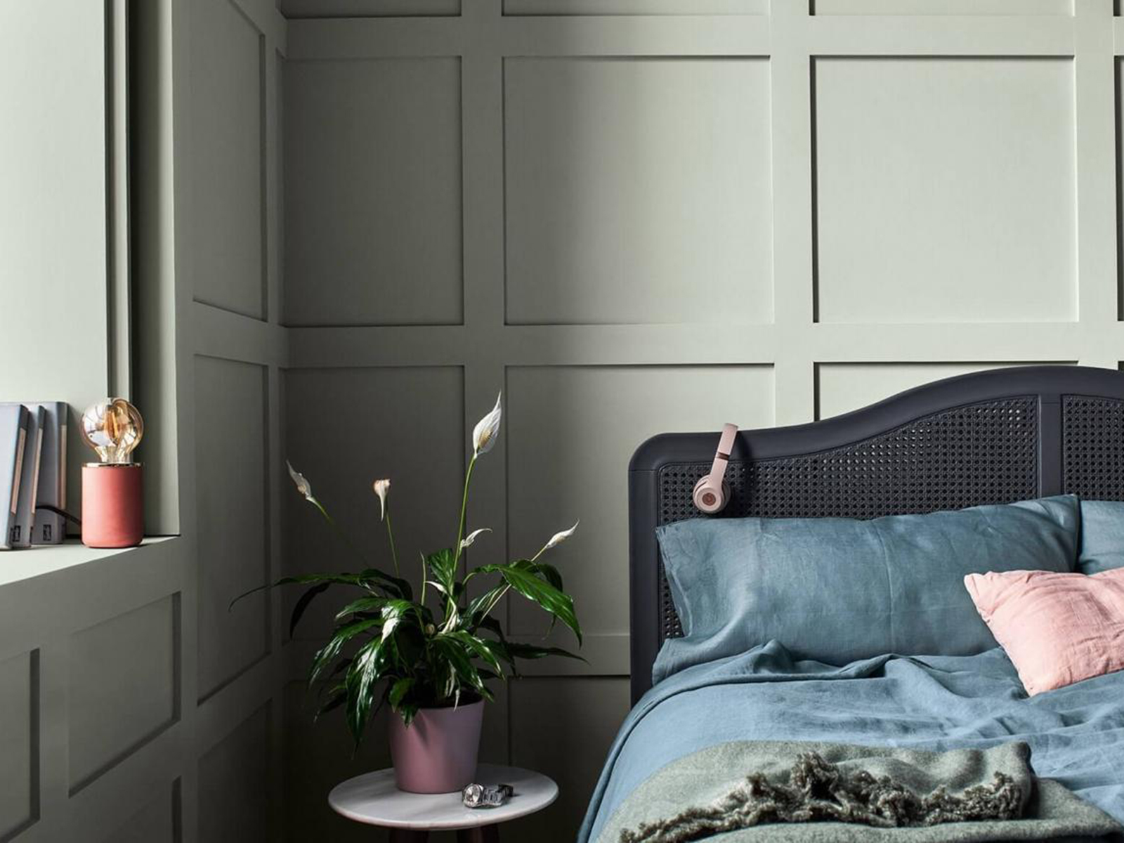
Dulux Colour of the year 2010 is “the colour that lies between the land and sky on a misty morning”. I notice that it changes quite signifiicantly depending on the light.
Want to find your happy hue? I have just two places left on my Ban the Beige workshop in London on the 10th October, where I share my tried and tested methods to help you discover your unique colour palette that works for you in your own home. Grab yourself a space here.
