Quick and easy Kitchen updates that make an impact

The kitchen is often described as the heart of the home; it’s a place where we can spend the most amount of time so creating an environment you enjoy being in is important. But if your home is anything like mine, it’s more like a war zone! Having your kitchen fully kitted out and renovated is knee-shakingly expensive and so many of us have to update what is already there. So I’ve jotted down my top ten ideas on how you can up your tired old kitchen in the style stakes. And if you are doing a new renovation, there are some good ideas here on how to make your kitchen space have a little more flair. As they often quite frankly look really dull, and as usual, I’m always against that!
1.Update your cabinet doors
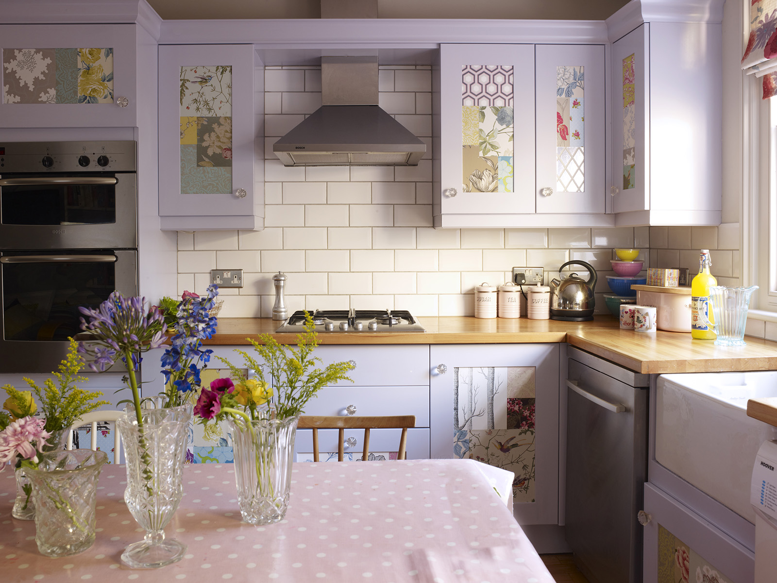
Painting your kitchen unit door fronts to give the room a whole new look is a well-known makeover hack. But buy yourself a tin of Zinsser primer and you can makeover a kitchen in just a weekend, as it foregoes the need to sand and undercoat. Just one coat of primer and then you’re ready to go with the topcoat in any colour of your choice. It even works on glossy laminate doors, just give them all the once over with a hand held sander before hand to increase the finish. If you have shaker doors, consider applying some patterned wallpaper with a topcoat of varnish to protect it inside the panels. Or mask up plain fronted doors in order to create some fashionable asymmetric patterns that run across the units.
2. Make the most of all the cupboard space to clear the clutter
Kitchen worktops can quickly begin to look like a cluttered and unsightly mess, as I know only too well! Get as much off the worktop as you can and re-organise your cupboards. A nifty idea is to place a lazy Susan inside your corner cupboards so you can easily access jars and bottles.
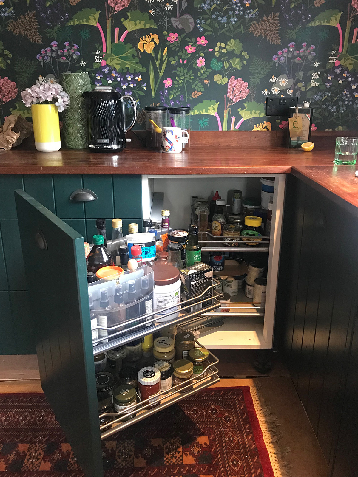
Rabarber wallpaper by BorasTapeter at Wallpaper Direct. Kitchen units by Howdens. Door fronts made by my local carpenter and painted Hunters Green by Zoffany.
3. Style up your worktops like a professional interior stylist
With your neat and tidy worktops you can start to think about how to style them up. Aim to have only lovely things on display (the cereal packets and Tupperware are banished) and play around with grouping your items. You can keep it neat and formal by arranging things in pairs. Or group different items together in odd numbers, like 5 or 3. It works well visually to make sure you have items of different height and texture too. The new Flow range from Breville is definitely good looking enough to make a star appearance and I chose a dark kettle to blend in with my dark coloured wallpaper.
4.Wallpaper the walls in a bold pattern
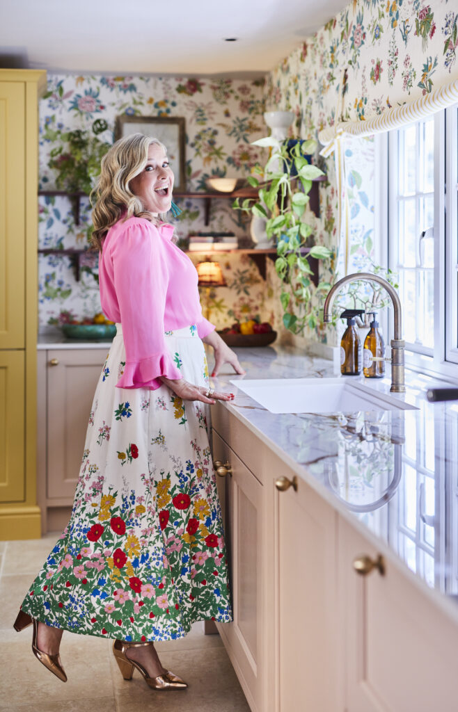
I’m a real colour lover and enjoy adding as much as I can to my designs and the kitchen has plenty of opportunity. I’ve just wallpapered mine in a brightly coloured botanical wallpaper and it looks thrilling. My tip is to only paper areas away from cooking and sink area. If you are still worried a couple of coats of matt varnish will make it wipeable, however this dark pattern will hide a multitude of splats! You can then have fun grouping things in terms of colour families to match in with your new scheme, from your collection of cookbooks to your crockery. This will also help your room not feel too cluttered and bring a sense of harmony.
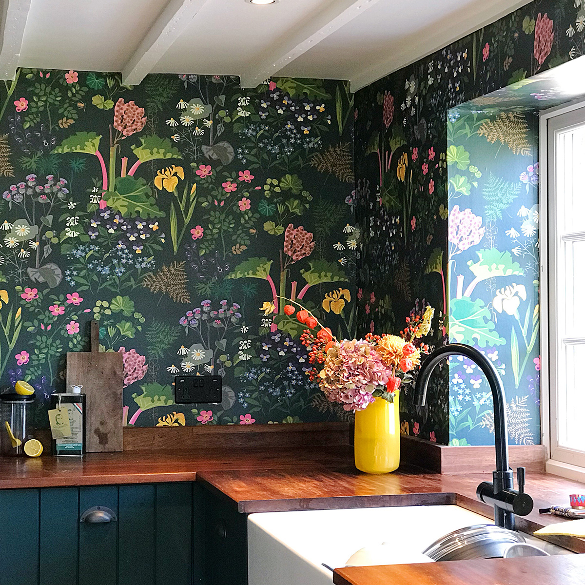
Rabarber wallpaper by BorasTapeter at Wallpaper Direct
5. Upgrade the worktop to a colourful one
Just replacing the worktop can be a real game changer and not too hard to do. Believe it or not I’m a real fan of affordable laminate worktops. But rather than the naff fake granite or wood designs, pick one in a modern pop of colour like the colour du jour pale pink or a rich forest green. It can suddenly become the star of the show and colour soaked kitchens are set to be the next big trend in interiors. If changing up the worktop highlights how grotty the cupboard doors are, you could think about replacing them. There are some great replacement door companies out there but I particularly rate Naked Doors and Superfront. Or like I did, ask you carpenter to make you some bespoke door fronts in your own design.
6. Introduce texture in your neutral kitchen
If however, you are a lover of neutrals and like things plain and simple you need to think about introducing texture to stop you’re kitchen appearing bland and uninteresting. From hand thrown ceramics, wooden bowls, through to metallic utensils you can quickly create plenty of visual interest. The Flow range from Breville, with its stylishly textured appearance is just perfect for this chic and minimal look.
7. Display favourite thing in open shelves
Ditch the wall units in favour of some open plan shelving. You can go sleek and modern with floating shelves and some swish LED back lighting or go for a more rustic edge with reclaimed scaffold planks. Either way this is a great way to show off your collection of favourite cookbooks, storage jars and glasses. I’d always trough in some favourite ornaments or photo’s too to stop it appearing too utilitarian. Have fun styling your open shelves to make the perfect #shelfie
8. Tile stickers hide a multitude of tile crimes
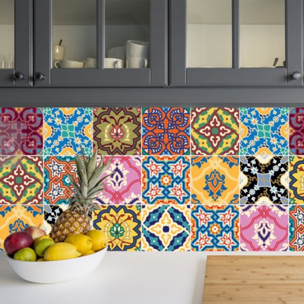
Tile stickers are such a quick and instant way to update tiles that no longer suite your scheme. You can get amazing patterned designs or something that mimics real stone. There are lots of design possibilities and it’s a great way to add some instant personality. Better still you can just peel them off when you fancy a new look.
9.Create a living wall
Living walls are such a hot trend in interiors and the kitchen is a great opportunity to get this look. Create your living wall by arranging a series of potted herbs hanging from the wall on hooks or on a wall rack. They’ll be useful for cooking too.
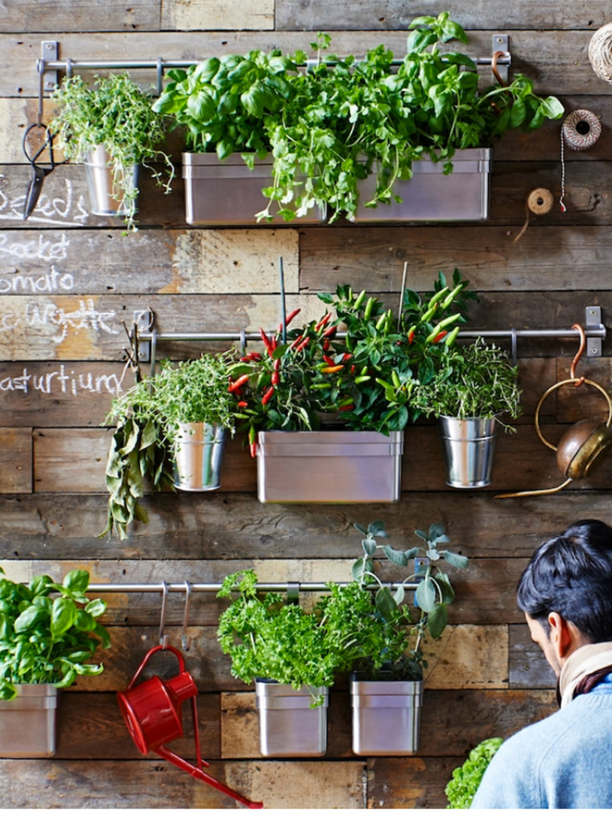
Kungsfors range at Ikea
10. Fill the floor with fabulousness
When ever I’m designing a room on a budget I often think of where I can make the most impact for the least money. And in my opinion that is often the floor. For ease and affordability I’d roll out a new piece of lino in a really eye arresting bold geometric print. So very fashionable and a great focal point in the room. If tis is too big an undertaking consider a jazzy rug. You can get plastic ones (often designed to go in gardens) which are particularly practical.

Carousel vinyl floor by Atra Floor
comments
Choose a color palette that could complement your kitchen without over designing. The idea is to create a place and space that would be homely to start your day with a hearty meal.


