13 interior design crimes and how to avoid them

Last weekend I did a 14 hour round trip to deliver a talk at the Essential Edinburgh Life and Style event. The organisers asked me if I’d talk about what I consider the worst design crimes and well, I had a lot of time to think about it! Here’s my top 13 (because I couldn’t stop at 10), and just to be helpful, I talk about how to avoid them too. It’s all a bit tongue in cheek as I’m sure we’ve all been guilty of a few of these but now you can’t say you’ve not been told.
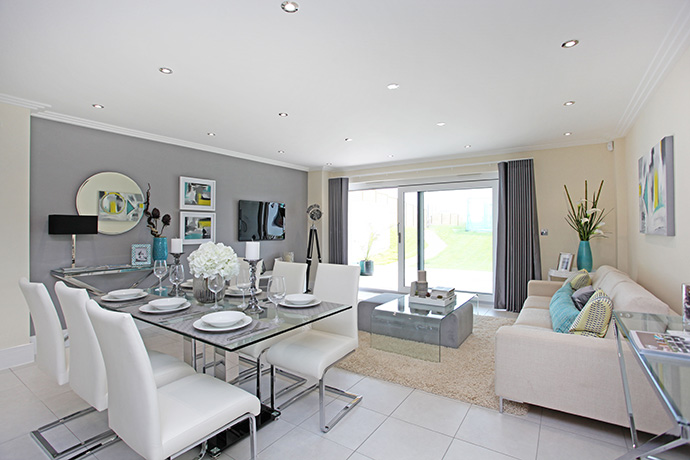
Design Crime number 1: Tasteful interiors
Rather controversially I’d rather be offended and outraged by an interior design scheme rather than well, not moved by any emotion at all. In my view interior design is a great way to express creativity, and celebrate design. So yes, have an opinion, and I don’t care if you don’t like it. But lets not have boring copy-cat Pinterest-porn schemes. Good design is all about tapping into your inner interior design goddess. Dare to be different and push the boundaries.
Design Crime number 2: Beige
No one who follows this blog is going to be surprised at this one! But in all seriousness, beige interior schemes literally kill me off quicker than a Night Walker from Game of Thrones. However if you are going to live your life in neutral- then please watch my video on how to decorate with neutrals here, because all too quickly beige falls into bland.
Design crime number 3: Neglected hallways
Fist impressions count and never were truer than when considering the entrance to your home. Sure you want to create a lovely welcome for guests but you also want to be met with a good vibe as you walk through the door and I’m astounded how unloved our front porches and hallways are. Recycling bins, scooters and heaving hallways stuffed full of coats and shoes have a lot to answer for. So get some systems in place, use the wall space, build a shed for the bins and paint your hallway an eye- poppingly happy colour!
Design crime number 4: Clutter
Now this is a very modern day problem and as we are the generation of rabid consumers and our homes are straining to cope. The pain is very real and results in more family arguments than is worth any box set collection of DVD’s. If you’re redecorating this is the perfect time to be ruthless- because I promise you your newly decorated room will fail spectacularly as soon as you put all the clutter back. No amount of tasteful Farrow and Ball paint will disguise it. So plan in some sufficient storage and if it don’t look pretty; hide it behind some cupboard doors.
Design crime number 5: Ma-hoo-sive TV’s
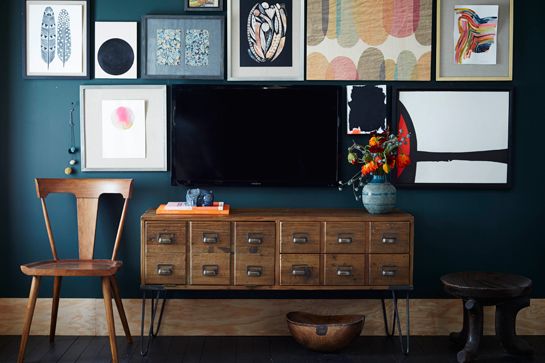
Interior designers have always grappled with this far from perfect problem. As much as we chatter on about rooms requiring a focal point- we never meant it to be that gawping big black hole. But TV’s are not going anywhere and they sure ain’t getting smaller. So aside from hiding it inside cumbersome cabinetry, its best I think to try and disguise it. Painting the wall behind it a dark colour, works a treat.
Design Crime number 6: Yellow bedrooms
Don’t get me wrong, I love yellow. It’s perky and positive, uplifting and activating. So you really don’t want it in your bedroom do you. Also it makes your skin look a funny sallow colour. Pick a pink or nude neutral- so much more flattering!
Design crime number 7: The feature wall of fear
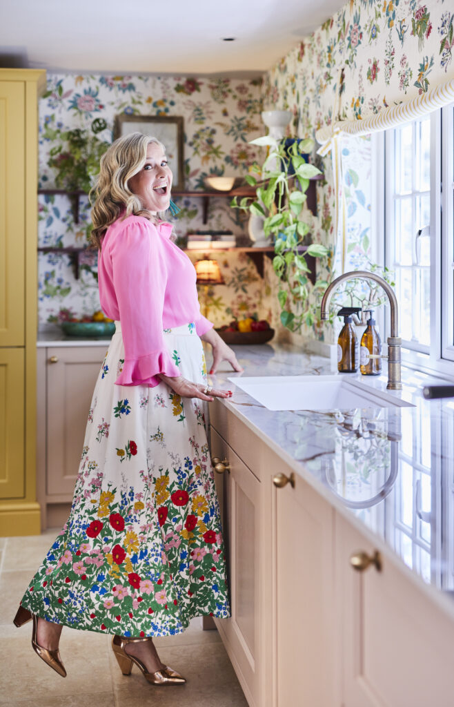
It’s been a thing for a while, the idea of painting or papering one wall in something that you’d dare not do otherwise. But those timid days are behind us and the trend now is to very much go for it and paper the whole room or paint the whole space in a bold, pulse quickening deep colour. Or god darn it why not paper the ceiling too while you’re at it! In fact I think feature floors have taken over from feature walls, as seen in the droolworthy home of Erica Davies.
Design crime number 8: The lonely pendant light
This is especially serious if said pendant light has a drum shade with a sad little light bulb burning down on everyone’s crowns, washing the room in an indiscriminate glare of light. So if you are going to have a pendant light, hang it down low, especially over a coffee or dining table but then layer the light with wall lights, lamps, pendant lights, even a bevy of fairy lights if you must, to create some depth and moodiness to your space.
Design crime number 9: Messy bookshelves
So I know books are a great way to accessorise a room and make it feel like a home which is what I’m all for. But sometime you need to take a little stock take. Do you really need to keep every tatty holiday paperback book, every lonely planet guide? Surely that DVD collection is now available on Netflicks? Better to create library nook or fit shelving on the landing or study. Book cases need to be curated, and part of the display. And the jury is very much still oput on whether you’re allowed to colour code the spines.
Design crime number 10: Short curtains
Unless you have a quaint country cottage you aren’t allowed anywhere near short curtains EVER. All curtains must touch the floor. End of. It looks elegant. And if you combine with a blind that you can draw in winter, you get over any heat-piling-out-of-the-window- radiator angst. Although my mum used to always tuck them up over the top of the rad, which is a particularly special look.
Design crime number 11: Titchy rugs
Like almost everything in design you can apply the ‘bigger the better rule’ again here. A large rug that fits under 2 thirds of the bed really anchors the room. In the living room a rug should be large enough for the front feet of the sofa to sit on ideally and in the dining room get all the chairs over it. Otherwise you’re just creating a desert island. And while we’re at it a rug is a great opportunity to create a feature floor (see number 7)!
Design Crime number 12: The catalogue look
This is where a look has been lifted straight out of the page of the catalogue. You know the one, with curtains that co-ordinate with the cushions and there is a ready to buy collection of vases and accessories that ‘get the look’. You buy it all in one go and move in and never feel you have to change anything ever again. So repeat after me, though shalt never indulge in the overly mathcy-matchy. That goes for three-piece suites and co-ordinating ranges of furniture too.
Design crime 13: Pictures hung too high
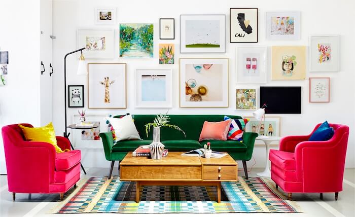
Artwork is one of my favourite ways to add style and personality to a space and I think it’s really worth investing in. My preferred method is a galley wall because it’s fluid and organic so you can add and subtract over time and it makes a striking focal point in the room. Failing that, again go big. Nothing sadder than a little picture, hung too high bobbing around on its lonesome in the middle of the big bad wall.
Crikey- well that all felt good to get off my chest. If you’ve got any more to add, pop them down in the comments below. I’m sure I’ve missed LOADS out!
Save
comments
The perfect list Sophie, love this. I’m also driven crazy by a lack of lighting, and the insistence on using one single ceiling light to light the space . Aargh.
Oh my word.. have lost the battle with my man regarding the enormooooose TV.. you have inspired me!!!
You’ve nailed it, ah the matchy-matchy look is the worst! And yes for feature ceilings and floors!!
I’m guilty of the feature wall in my new living room design but then Prism is far too busy for the whole room! I agree with the matchy matchyness, I’m trying to pursuade friends and family not to do it. It’s an ongoing battle!
Love this! The thing I see in holiday homes all the time is the short curtain thing! It immediately says “cutting corners” and that’s not the impression to give at all!. Also the pictures hung too high bugs me sooo much. As does one (or two) titchy pictures hung above the bed.
Oh I love this!!! I did a post last summer with my own design pet peeves and many of yours made my list too – also included? Artwork hung too high (cringe), the ‘Dr’s Waiting Room’ look and forgetting to accessorise! I tried to include the link here but I was told my comment was too spammy (ha!) so you’ll just have to take my word for it!! lol xxx
I am guilty of the feature wall so I may extend my wallpapering. I also have a gallery wall, but having seen the image above I’ll be adding a few more.
With curtains, I have short curtains that hang just below the windowsill, above the radiator. Am I right in thinking you suggest floor length curtains that remain open and a blind to close as needed?
I totally agree with all of these (even though I’m guilty of a couple of them myself-eeek), especially number 1. I’d much rather think someone’s interior is bonkers or weird than bland and generic-at least they’ve been adventurous and put their stamp on it! xx
You’re the best! Love this. I just moved into a new 1000 sq ft apt in NYC. Dealing with no pantry so put doored shelves in hallway – half door, half glass from –yikes– IKEA. Doing my best here with the budget. The hall is only 36 inches wide but runs the whole length of the apt. Any suggestions for the welcoming entrance? That doesn’t crowd it too much?
Excellent blog, love the line “But in all seriousness, beige interior schemes literally kill me off quicker than a Night Walker from Game of Thrones.” haha
Also, love the skirting board and architrave in the hall shot.
Cheap door handles, poor doors are often forgotten in a beautiful room. Hence why ours are all abstract neon geometric. Also, painted our living room floor recently with stripes so don’t want to cover ny hard work with a rug!
Great list! Beige (and grey in th Netherlands) makes me almost angry and such a missed opportunity. Pictures hung too high is a commonly made mistake and such a pity.
I would add letters or texts in an interior. Soulless solution to lack of personality and rarely adding any esthetic value
This post is spot on Sophie and so many points rang true with me (although do love a neutral palette)! Hanging artwork really high is such a pet peeve of mine, yet so many people are reluctant to go lower, forgetting that the eye-line is key. This, along with wall sconces and pendant lighting going up too high! I also have a massive aversion to spot lights! Nothing worse than going to a dinner party and basking in over-lit, one-dimensional spot-light vibrancy. Totally kills the atmosphere, doesn’t it?!
As someone a bit yellow-obsessed, I have to admit I recently accented a teenage boy’s bedroom with playful yellow accents. (The evidence is on the CONTACT page of my GIRL ABOUT HOUSE blog). I feel it works in this instance – small doses. Can we retrieve it from Room 101 please?!
Absolutely nailed it… matchy matchy curtains and cushions and short curtains…. my absolute pet peeves…..!
I’m all for ‘balls out’ colour and paper too….
I work for a new homes builder and just want to get my hands on the showhomes! The same colour scheme through the whole house… we have matching curtains, cushions and arm chairs in one!
I would love to do these myself and actually design something that isn’t your “standard showhome”
Great work Sophie! ❤️
Great list, Sophie! I’d add having too many exposed legs on tables, chairs, sofas. It is difficult to avoid with a mid century modern, contemporary, or industrial scheme. However, skirting chairs or a sofa, even a table adds texture. When the front, back and sides are done in different patterns, you can promote further the personality of the design you are aiming for.
Ugh….Sophie…yet again you’ve just inspired me! I’ve let my bookshelves go, and was thinking of going taupe in the hallway/stairs/landing…I’m now styling my Homebarn shelving and ridding old CD’s….yes…CD’s!!! WHOOO?!!
I completely agree about short curtains…..however I’m having a dilemma in my Edwardian terraced house as two rooms (main bedroom and living room) have the longest radiators ever, running the full width of the rooms (I think due to the low sills of the windows), with the windows sat in the middle. I’m considering roman blinds however not sure if the windows are too big and would like to be able to soften the look and window edges with curtains, but they would constantly hang over the radiators. Help!
A little late reading this post, but these points are so relevant. Point 8 on lighting is huge and makes a massive difference to a room, but normally means chopping the plaster out of walls to run cables, Its hugely rewarding, but a big pain. Got any work arounds that you’ve used for this?
Great list – totally agree with the catalogue home. It’s easy to end up with a living room that looks like an IKEA set up and feel totally alienated from them, it’s important that your interior design reflects you – that’s the best way to create a natural, expressive space – and reprinting a page out of IKEA’s monthly range is not going to reflect you no matter how much it speaks to you.
I totally agree that too often our vision of a ‘perfect’ home is a home without personality: beige, empty, “tasteful”, as you so well put. There must be a subject to this “taste” – it should be our own, personal taste, that we search out and cultivate and absolutely adore. The wealth of images given by home shows on TV, and Instagram and Pinterest means that we condense these into one clean, white image that, in reality, is the dullest version of home decor one could create.
Informative and insightful post on what interior design errors/mistakes to avoid. Thanks for writing and sharing this post with us.
Loved reading this blog, Sophie! I too hate messy bookshelves and it is a BIG NO for anyone! I always keep it organized and decluttered.


