How to Mix Patterns
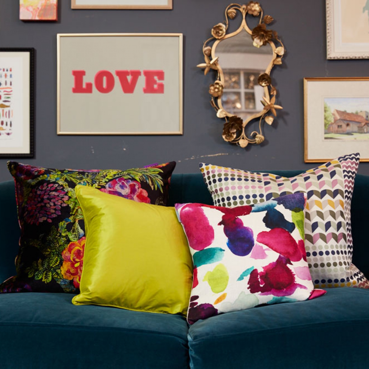
My signature style is all about embracing colour and pattern, and I just love to mash up the styles in order to achieve an individual and creative look. I’m always moaning on The Great Interior Design Challenge that I hate the overly matchy matchy as I feel it lacks originality. In this first of my YouTube videos, I share will you how I mix up the pattern and the print in my own interior design scheme.
To recap the rules are:
Play with scale by mixing both large and small prints
Think of a colour story to link all the different patterns
Add a plain fabric to break up the pace
Here are some of my favourite retailers as shown in this video
Sofa: http://www.sofa.com/shop/sofas/snowdrop/
Geometric cushion: http://www.margoselby.com/
Floral cushion: http://www.liberty.co.uk/pws/ProductDetails.ice?ProductID=121274
Abstract print cushion: http://www.bluebellgray.com/shop/cushions/portree-beaumont/
comments
Love your video tips. Fun and impact 🙂 I hope you’ll like my cushion covers. Much LoVe. xox Nik A Ramli
Really enjoyed your first video! Can’t wait to see more! Love to see high street mixed in too if possible in other videos!
It’s great to see how the cushions/fabrics work together – otherwise there can be some expensive mistakes! I got the last Liberty Print cushion & Margo Selby fabrics/colours are amazing! Also found a nice green geometric print cushion in M&S to complete my homage! Many thanks for the expert advice.
