13
Nov
14
20 new interior design rules

I get asked alot about what’s hot in design, the latest trends and how to go about designing a space yourself. In the creative world of interior design there are no hard and fast rules- as soon as there are it becomes cool to break them anyway! But I thought I’d pop down my top 20 design rules that you can use to easily update or improve your home. Some are new ideas- some are just good old tried and tested design rules that are good to revisit.
- Get personal! The popularity of creative Interior Design is due a comeback. For too long during the property boom we have been told to decorate in neutral colours in the hope of a bigger profit on the resale. Now we’re looking to stay put a little longer it’s time to make our houses a home again. So rule number one is get personal- tune into your own sense of style and identity and enjoy the creative process. Check out old school interior decorators like Dorothy Draper and David Hicks to see how it really is about time we revisited a riot of colour and pattern in our interiors. Ban the beige and move away from middle of the road.
- Dress your windows. A window is to a view what a frame is to a painting. So don’t overlook them and ensure they are well dressed. Dusty Venetian blinds and too-short-curtains are emphatically NOT the way to go. Curtains should always touch the floor, otherwise they just look stingy in my opinion. One option is to use them to decorate the room but not to draw them in the evening while the radiators are on, and have an accompanying blinds as well. I love combining curtains and blinds in co-coordinating fabrics for the ultimate well dressed look. Go for extra long curtains that softly puddle on the floor for a more elegant look.
- Lamps not lights. Professional Interior designers use complicated lighting designs to create amazing visual effects within a room. However you can easily start to ring the changes at home. Avoid the rather over used down lighters (aka “developers acne” according to Daniel Hopwood) in favour of wall lights, spotlights and lamps that are more versatile. They can create a softer or more dramatic ambience, ideally controlled by a dimmer switch. Down lights and pendant lights cast a rather nasty shadow over your face giving everyone bags under their eyes, so don’t rely on them being your main source of lighting in living rooms or bedrooms. How unflattering!
- Create instant impact with a feature wall. Having one wall in the room papered or painted a contrasting colour, has been popular for a while, as its an easy and affordable way to inject some style into your interior. For me bold is best as pale colours and weak prints just don’t make the grade. Balance the look by choosing the wall behind your sofa or headboard and that way when you’re relaxing you don’t have to look at it all the time. However be sure to integrate it into the rest of the scheme by using the same colour or print elsewhere in the room, helping the eye to travel all around.
- The new neutral. Grey has replaced beige as the go-to neutral but I’d advise a warmer shade as bluey greys leave a room feeling dank. Consider cosying up the look with a warm accent colour like red, sunshine yellow, copper or natural tones of wood when choosing accessories.
- Respect the period details. We now all know that stripping out your homes period features is a crime but if you prefer a contemporary look, consider painting the walls, moldings, doors and architraves, all one and the same colour. This stops the period details jumping out and creates a more modern effect.
- Keep it cosy. Hard floors have never been hipper, but leave your home feeling chilly and draughty underfoot. A large area rug will cosy it up, and you can always roll it away or easily replace it. The current trend is for very bold designs, like a piece of artwork on the floor. My favourite deisgns have always been from The Rug Company, although I’ve never been able to afford one. For a budget option, consider having a carpet remnant whipped around the edges.
- Create flow in your open plan spaces. Open plan living has thrown up all types of design dilemmas. Firstly consider the space as a whole and choose a comprehensive scheme that flows; same finish on floors and walls. Next zone the different areas with a signature rug, low-level pendant lights or accessories in a different accent colour.
- Kill the clutter. No matter how beautiful a design scheme, it’s instantly killed off by unnecessary stuff. Resist muddling up shelves and surfaces with unnecessary knick-knacks, and instead favour grouping a few well-chosen pieces that tell the ‘story’. For example group family photos together for a wall display or together on the side board, rather than smattering them all around the room. For more ideas visit my blog post Ways to display and the Law of Grouping.
- Devils in the detail. ‘The details are not the details. They make the design’ said famous designer Charles Eames, and I think he was onto something. Things we come into contact every day like light switches, door handles, drawer knobs, and taps, if they’re nicely designed, feel so much better. So this weekend, oil that squeaky door handle and update all your kitchen knobs!
- First impressions count. From Georgian to Victorian, designers cared about first impressions and you see front doors, entrances and hallways featuring beautiful carpentry, tiles, stained glass and lighting. One of the quickest and easiest ways to improve the look of your home starts at the front door. A lick of high gloss paint on the front door and a twinkly chandelier in the hallway would be a great start.
- Mix old and new. ‘Eclectic’ is the new buzzword in interior design. It essentially means ‘Anything goes’ and follows the idea that our rooms shouldn’t follow a formula, with everything matching. That’s what I call the ‘straight out of a catalogue’ effect and it should be avoided at all costs. Instead aim to create a home that appears to have evolved organically thereby feeling more original. A great way to achieve this is to mix period pieces with something contemporary or vice versa.
- Move over to the dark side. Its often believed in order to make a room feel larger you need to paint it pale. In fact the opposite can be true as dark colours recede away from the eye giving a room more depth. However make sure you use plenty of effective lighting and break up the wall colour with white framed prints and mirrors for a dramatic effect. More ideas can be found on my blog post Decorating on the dark side
- Think in pairs. Styling items in pairs is a great way to get that ‘Interior Designed’ look. A pair of lamps either side of the sofa, a pair of large glass vases on the dining table or a pair of prints above the bed. The symmetry it creates helps make a room look put together.
- Upcycle. This buzz word in design right now is where you take an unloved item like a piece of furniture and customise or reinvent it to make you love it again. By getting your existing furniture to work with a new scheme your saving money and not adding to landfill. You’ll also be the proud owner of a one off original.
- Paint your radiators. Radiators are a bug-bear within a room design. They’re often in the wrong place and look ugly. Forget costly radiator covers ( that also hinder the efficiency of your heating) and simply paint the radiator in the same colour as the walls to help it visually disappear. Use an acrylic eggshell rather than emulsion.
- White’s not always right. The belief that Pure Brilliant white makes a room feel larger and brighter in my opinion leaves it feeling dull and depressing. It’s due to the blue pigment in the paint. My advice is only use white in south facing, sun filled rooms. Everywhere else choose a warmer shade of pale, like an off white or warm grey.
- Neutral basics when on a budget. When decorating on a budget think neutral for the big purchases like sofas and floor coverings as they form your blank canvas. Then you can have fun adding colour and design with the accessories, even building up the look over time. It’s also easier to ring the changes more often.
- Size matters. Furniture seems to be getting bigger and bigger- large corner sofas and super king size beds are all the rage. If you have a modest room, prevent it feeling crammed by choosing sofas and armchairs on legs and bedsteads rather than divans, which will help create the illusion of space at least!
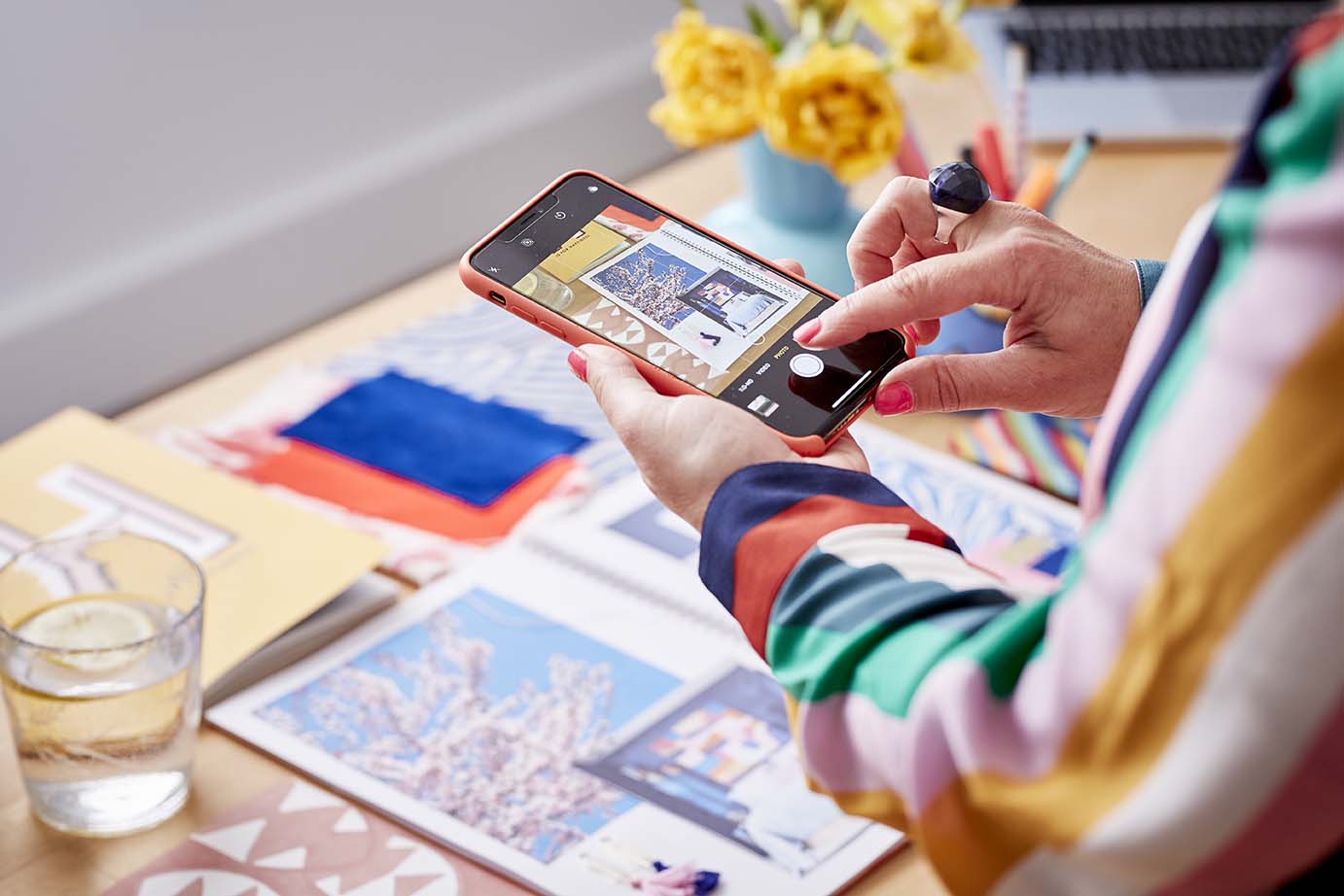
- The 5 P’s. “Perfect Planning Prevents Poor Performance”. It’s an overwhelming task redesigning a whole room and with the time and money invested its important to get right. Begin with a mood board- where you gather all your inspiration images, tear sheets, paint chips, floor samples and swatches in one place to check they all work together. There is a great Moodboard app on the ipad that I love to use to paste images from Pinterest and websites so I can build up a scheme very easily. You can learn more by reading my post Create a mood board.
Please feel free to leave your comments below and let me know what your top design rules are…
Image at the top of this post is from Marks and Spencer.


 proof that your landing de


