10 top styling tips on how to quickly, cheaply and easily update a room

The Great Interior Design Challenge is now over for another year. All together now…Ahhhhhh! It leaves everyone wanting to update their own homes, and often as quickly and as cheaply as the contestants managed. People often ask me what my impresses me most about the amateur designers and I have to say the one thing that astonishes me time and time again is just how much the designers achieve given the time constraints and the tight budget. I think it’s a really good wake up call to us all to be creative, think outside of the box and be resourceful. So with that in mind here are my top ten ways to improve the look of your home, quickly, easily and affordably.
- Paint unloved furniture.
The trend for painted furniture continues apace and I think it’s a great way to bring tired, tatty or unloved furniture back to live and integrated within a new scheme. What I love about old ‘brown’ furniture is that it’s usually better quality than modern reproductions at a fraction of the cost. Armed with the right products, you can quickly transform it into something new and swoon-worthy in less than a day. Chalk paint is designed to go onto un-primed un-prepped wood quickly and easily in just one coat. Its thicker than regular paint so be warned, it achieves a rustic finish. Next seal with a clear furniture wax, which is essential as otherwise the water-based paint with wear off. For a crisper, more modern look, consider a one coat quick drying primer, with a topcoat in your colour choice. My design tip for a modern look would be use a bright colour that pops in your scheme. For more ideas on how to use Chalk paint, take a look at my post about Upcycling with Lynne Lambourne.
- Hang a large mirror or collection of mirrors
Mirrors are a great interior designers tool. They hold the magic of illusion as they hold the power to punch some extra light into your room, make it feel bigger than it really is, and add a glimmer of glamour. But you have to go large. Either one large piece or my preference is a collection of smaller mirrors, grouped together to add design interest as well as light. It doesn’t have to be expensive. You can make a collection of vintage mirrors or buy simple unframed shapes and arrange them in a grid on your wall.
- Create a feature
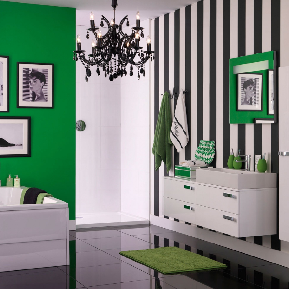
While the ‘feature wall’ has be relegated to Room 101 by interior designers, I still think if done correctly, it’s a great way to inject some colour or pattern in your room, quickly, easily and above all affordably. The trick is to make sure your bold paint colour or wallpaper is integrated into the rest of the scheme. For example try and make sure that the feature wall and the remaining walls tone together nicely by avoiding too much contrast. Try hanging a large artwork or mirrors on the feature wall so it doesn’t stand out too much and use the colour or pattern elsewhere in your scheme so it flows.
- Say it with flowers
So often we put so much effort into our room schemes that we forget about the finishing touches, which really can be the icing on the cake. I enjoy treating myself to a bunch of blooms from time to time, sitting them casually in a vase on my dining table. It’s a way of adding a new colour to your room and celebrating the seasons. Fresh is my preference but I also have a large collection of faux flowers. I’ve been collecting them for years, as they’re useful on photo shoots. The way to keep the look modern is to go for big blousy styles like peonies or hydrangeas and pack one type and colour into a large vase.
- Dress the bed
One of the easiest ways to take your bedroom from looking glum to glam is to put a little thought into how the bed is dressed. A fresh set of bed linen would do the trick, plump cushions, and rather than lots of little scatters I prefer a just two big 60cm square cushions in a fabulous signature fabric. Great for propping up for morning tea in bed too. Fabrics are a great way to add texture pattern or colour to your bedroom scheme so think about how a few well chosen accessories; a throw, cushions along with the headboard can work together to create a coherent look.
- Keep it cosy underfoot
I’m a fan of the trend for hardwood floors. I love the way they look with the benefit that they are easy to keep clean; I have them throughout my own home. However, I hate to see a hard floor without a rug- or any room without a rug for that matter, as in my opinion, it makes a room feel empty and cold. Choose a design in a bold colour or design to visually pull the scheme together and centre the room. The trend at the moment is to choose a design that’s bold and graphic- think of it like an artwork for the floor. You can find plenty of affordable options on the high street; pop it on the floor and voila- instant style statement.
- Style your Bookshelves
One bugbear that both Daniel Hopwood and myself share, having seen many people’s homes throughout the country is the amount shelves groaning under the weight of unsightly paperbacks. Bookcases are a great opportunity to display a few favourite tomes, some objets poignantly poised and perhaps a few photos of fond ones. But the reality is bookcases stuffed to the gills with plastic DVD boxes and tatty paperback, which is such a missed opportunity. Bookcases are a great way to create a personal display and compliment the room, so bring some order, buy a DVD carousel or put them all in cupboards. And the collection of travel guides, unless you’re going back there anytime soon, time to pass them on.
- Kill the clutter
One of the easiest and cost effective ways to improve your room’s appearance is to get rid of unnecessary clutter. I am by no means a minimalist, I verge on obsessive hoarder if I’m honest, but I have regular clear outs by editing the things I have in my home. Getting rid of your unwanted items has never been easier. Check out a great organistion called Freecycle where you can donate your stuff to whoever will come and take it away. You can do your bit for charity, some organisations will even come and collect it or raise some money for your renovation fund by setting up a stall at the local car boot or selling stuff online. Either way, practice the mantra- use it or lose it!
- Devil’s in the detail
Designing a room is by all means a daunting task- there is so much to think about and so many elements that all have to hang together. However on small area that I think can make all the difference is the little details. For example there is nothing more irritating than drawers that stick, or handles that feel awkward to use. A great tip is to rub candle wax on the runs of old timber drawers so they glide smoothly. I’ve just done that to an old pine kitchen dresser and now it’s a joy to use. Think about updating the handles on your cupboards to something more interesting and invest in quality door handles, as they’re something you use multiple times every day.
- Style with symmetry.
One of the easiest ways to transform your room is to arrange the items you already own more effectively. I think it can be as simple as thinking in pairs, and creating some symmetry to bring cohesion to your scheme. It may be a pair of matching armchairs, a pair of low side tables instead of a large coffee table. A pair of matching lamps on a console behind the sofa or a pair of matching bookcases either side of the sofa. However be careful not to over do it. A room also needs some rhythm so amongst the order add a little chaos. For example a tablescape of objects that are different shapes and heights or a collection of framed pictures that are different sizes. This will keep the scheme relaxed and interesting.
* This feature was earlier published on Good Housekeeping’s website.


 Around here, we


 After
From beige to boom! My bathroo
